Key Findings
Main takeaways for the 2023 Urban Environment and Social Inclusion Index analysis.
Chapter Authors
Angel Hsu
Xuewei Wang
Natalie Short
Diego Manya
1.Top-performing cities perform well on public transit, tree cover per capita and air quality, and they are primarily located in Europe and the United States, while less well-performing cities lag on air quality, especially fine particulate matter (PM25) pollution, and proximity to public transit, and are largely located in China and Africa.
To assess the environmental performance of cities, we evaluate four categories: air quality (orange), public transit (blue), urban heat island (red), and tree coverage (green). For more details on how we calculated these aggregated scores, see the Methods section, which provides a comprehensive explanation of how we determined city scores.
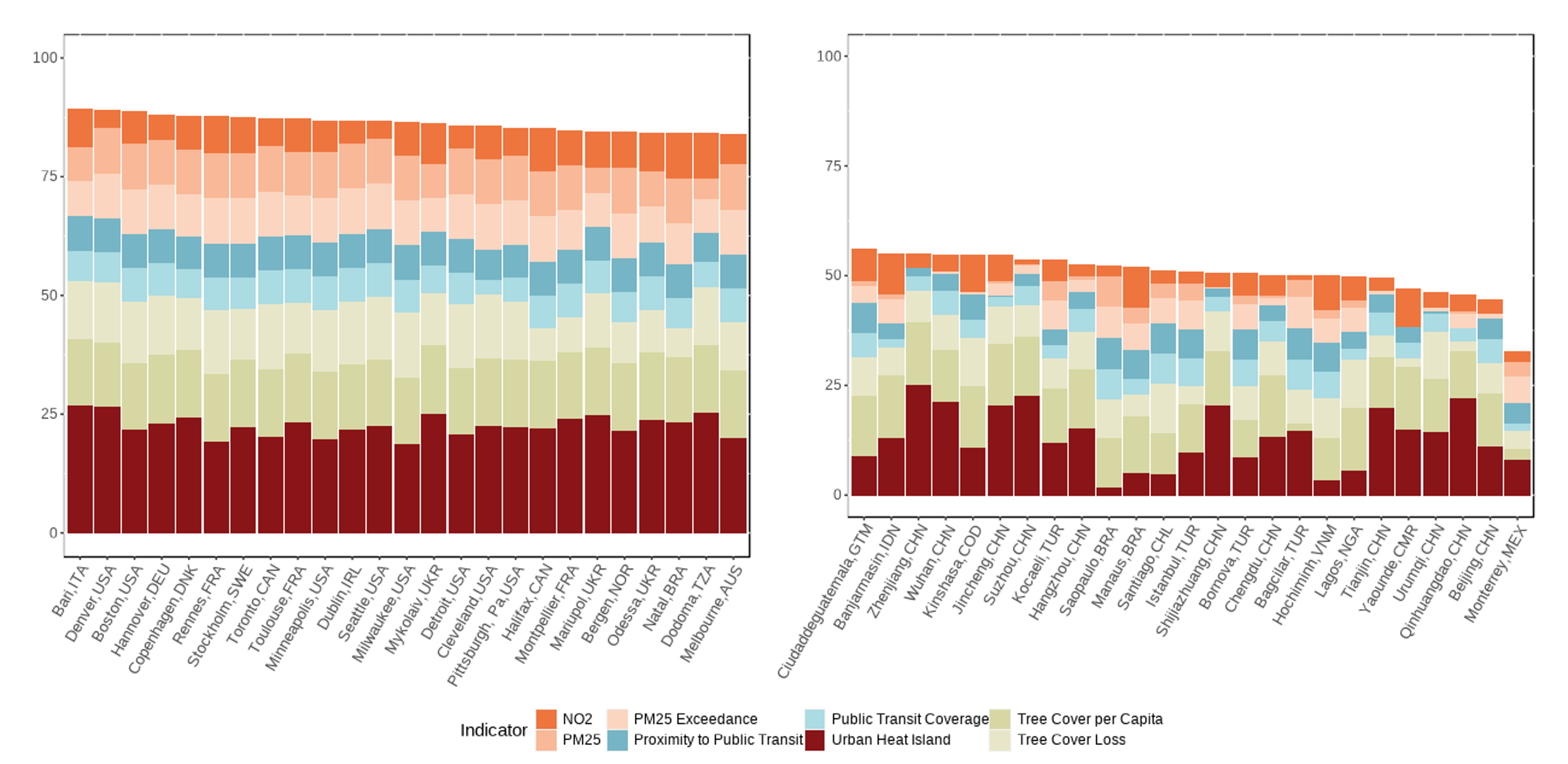
Top-performing UESI cities (Figure 1a) have consistently high scores in tree cover per capita, proximity to public transit, and fine particulate matter pollution (PM2.5), while there is more variation in their performance related to urban heat, tree cover loss, and nitrogen dioxide (NO2) concentration. Most of the top-performing cities are located in North America – including 8 cities from the U.S. – followed by 11 European cities, one South American city and one Australian city.
Figure 1b shows there is more variation in the indicator scores of the bottom 25 cities. Among the bottom 25 performing cities, most of them are located in Asia – including 9 cities from China – followed by 4 African cities, and 4 Latin American cities. Across the board, these cities are struggling on PM2.5 exposure and the urban heat island effect, while performance varies widely for NO2, tree cover, and public transit. For example, Sao Paulo, Brazil and Ho Chi Minh, Vietnam have low UHI scores, indicating an immediate need to improve management of heat exposure in their urban areas. By analyzing the data available for air quality indicators up until 2019, it is evident that several Chinese cities such as Beijing, Wuhan, Suzhou, and Hangzhou have failed to provide their inhabitants with safe and clean air.
Figure 1.a) Top 25 and b) Bottom 25 UESI cities by weighted average environmental performance. Cities in the lowest 10th population percentile of the index were omitted from these charts.
2. Despite Sustainable Development Goal 11’s (SDG-11) charge for cities to be both sustainable and inclusive, cities are not sharing environmental benefits and burdens equally.
While many cities perform well or above average on the UESI indicators, nearly half of the UESI cities (132 out of 276 or 48%) are failing to achieve these environmental results in an equitable way, disproportionately burdening less affluent citizens with poor air quality, exposure to urban heat, and lack of access to tree cover and public transport. As illustrated in Figure 2, the greatest number of cities are located in Quadrant 1 (84 or 30 percent), which indicates that performance and equity are not necessarily concurrent since these cities have strong environmental performance but are still disproportionately burdening their less affluent citizens. Quadrant 3, where 45 or 16 percent of cities are located, shows an even worse condition where poorer citizens have to disproportionately face negative environmental conditions in cities with already low performance. While improving environmental performance is desirable, it does not necessarily provide a more equitable environment, highlighting the need for cities and local governments to actively address issues of distributional equity as part of their environmental and development interventions regardless of their location, as we see that cities in the US, Europe, Asia, Africa, East Asia and the Pacific, and Oceania are burdening their poorer citizens.
Figure 2. A four-quadrant plot examining the relationship between environmental performance (in terms of average z-score, indicating the distance from the mean for a city’s performance on the UESI indicators) and equity (in terms of aggregated concentration index, see the Equity and Social Inclusion issue profile for more details). Cities towards the top of the chart perform better on environmental issues, while cities towards the bottom of the chart perform more poorly. Along the horizontal axis, the farther away cities are from the center of the figure, the more unequally environmental burdens are distributed. In cities towards the right-hand side of the figure, wealthier citizens are more heavily burdened, while in cities towards the left-hand side of the figure, poorer citizens are more heavily burdened.The number of cities located in each quadrant is signified in the corners of each quadrant (i.e., Q1=84; Q2=69; Q3=45; Q4=78)
3.Wealthier cities tend to have higher than average environmental performance compared to lower-income cities.
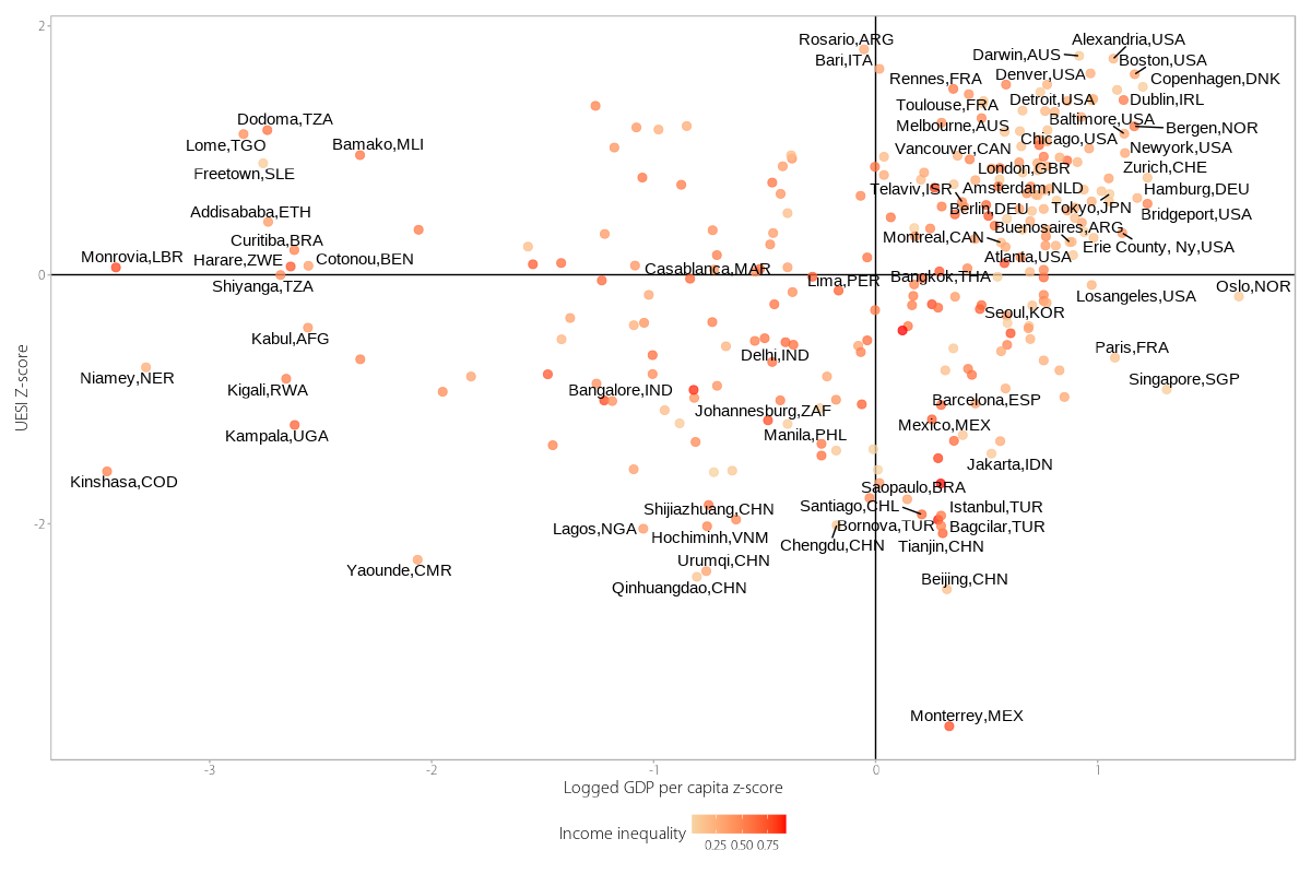
When comparing neighborhood income with average performance on UESI indicators, disparities between environmental outcomes and income are apparent. Most cities (113 of 276), including many North American and European cities, as well as some cities in Asia, Oceania, and Latin American Cities are found in the upper right-hand quadrant of Figure 3, indicating a better-than-average performance on UESI indicators and higher-than-average levels of GDP. The lower left-hand quadrant, where both UESI scores and GDP levels are on average lower, contains 67 cities many of them in developing countries, such as Chengdu, China; Manila, Philippines; Johanasburg, South Africa; Lagos, Nigeria; and Lima, Peru with most cities located in Asia, Africa and Latin America.
While this plot indicates that there are many cities with either higher or lower than average GDP and environmental performance, there are also other cities that have higher than average GDP and lower than average environmental performance (56), such as Singapore, Oslo, Paris, Sydney and Sao Paulo, as well as cities with lower than average GDP and higher than average environmental performance (40) such as San Jose, Rosario, Lome, and Addis Ababa. Overall this pattern indicates that the relation between economic development and environmental performance is not exclusively positive and is likely affected by other factors.
Figure 3. A four-quadrant plot examining the relationship between environmental performance (in terms of the z-score, or distance from the mean, for a neighborhood’s average performance on the UESI indicators) and a z-score of logged income across all city neighborhoods. Cities are shaded according to their income Gini coefficient, a measure of income inequality within the city. Those cities with higher levels of income inequality are darker, while those less unequal are shaded lighter. Cities in gray are missing sufficient data for the income Gini measure.
4. An unequal distribution of environmental benefits and hazards exacerbates the already unequal income distribution in about half of the global cities included in the UESI.
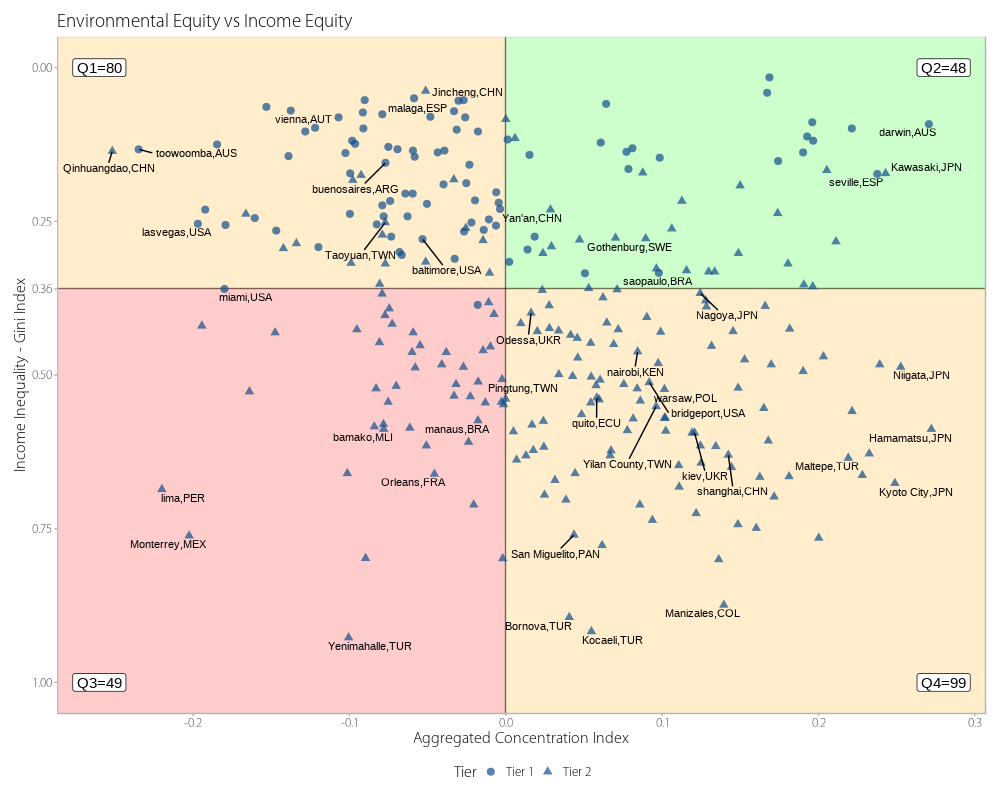
We found that 128 UESI cities allocate environmental outcomes (hazards or benefits) to less affluent populations (left-hand quadrants in Figure 4), while 147 cities allocate their environmental outcomes to more affluent citizens (right-hand quadrants in Figure 4). In addition, 48 of the cities allocating their outcomes to the less affluent are also cities with an income inequality higher than the average country inequality (World Bank Data 2018). This disparity creates conditions where existing income inequality is exacerbated by environmental inequality, applying an additional burden for the less affluent to bear (lower left-hand quadrant). Cities in this quadrant include cities in South America (Lima, Peru), Africa (Johannesburg, South Africa), Asia (Delhi, India), Europe (Bologna, Italy), Eastern Europe and Central Asia (Skopje, the Republic of Macedonia), and North America (Atlanta, United States).
While the lower left-hand quadrant of Figure 4 represents the most stark condition for the interaction of environmental inequity and income inequity, it should be noted that the higher left-hand quadrant, which includes 80 cities, also represents a situation where the burden of environmental inequalities is placed in the less affluent even if the income inequality is less severe. This last quadrant also includes cities from around the globe, but it’s particularly relevant for North American cities, since 34 of the 54 (62%) cities from this region included in the UESI are located in this category.
Finally, as previously mentioned , the cities in the right-hand quadrants in Figure 4 are those where wealthier populations bear the brunt of environmental outcomes and include cities in many areas of the world. However, it is important to note that most of the cities in these quadrants are Tier 2 cities that use Gross Domestic Product (GDP) from Kummu et al., 2018 as a proxy for income, due to the unavailability of accessible income information for those cities (see Methods). Due to this limitation, the calculations of the Concentration Index for those cities should be further explored and reevaluated using local income data, considering that on average Tier 2 cities have a higher aggregated Concentration Index than Tier 1 cities, which might suggest a possible overestimation of this value when using Kummu et al.’s GDP product (see further details in the Methods).
Figure 4. A four-quadrant plot examining the relationship between the aggregated Concentration Index for environmental inequality and the Gini Index for income inequality. The quadrants are created using the 0 value of environmental inequality, which represents perfect equity in the different environmental outcomes, and 0.36 as the average income inequality for all countries in the World Bank Data (2018). The number of cities located in each quadrant is signified in the corners of each quadrant (i.e., Q1=80; Q2=48; Q3=49; Q4=99).
5. A Global divide: More than half of European and North American cities perform above average, while larger shares of cities in Asia and developing countries perform below average.
Overall, UESI cities perform well on the environmental issues evaluated. A majority of the UESI cities (55%, or 153 out of 276) perform above average on environmental indicators like air pollution, urban heat, tree cover, and public transit access. However, performance varies between continents, and a clear divide exists between developed and developing regions.
Well over half of UESI cities located in Europe and North America perform above average on environmental indicators – 39 cities in North America and 58 cities in Europe. In Asia, 67 out of 87 cities included in the UESI perform below average, signaling more room to improve. However as can be seen in both plots there is high variability on the average concentration index, highlighting that no region shows a consistent equitable distribution of their environmental outcomes.
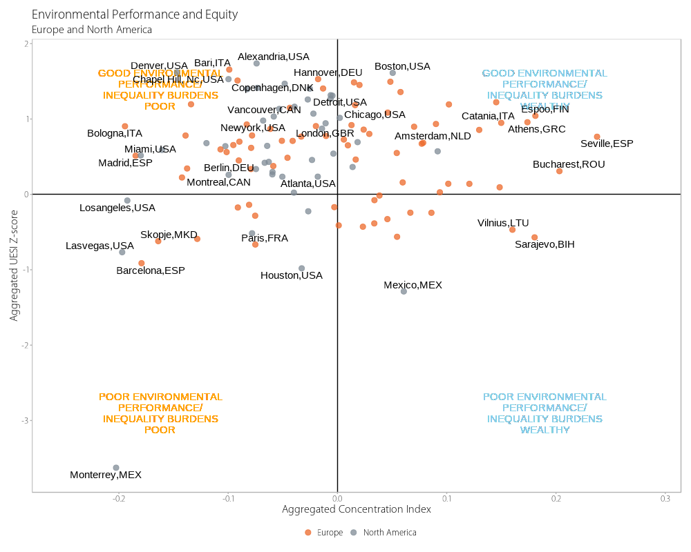
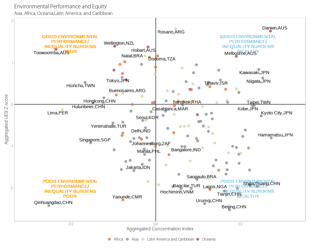
Figures 5a and 5b. The four-quadrant plot from Figure 2 is reproduced here, but split into two plots, with more developed, western cities in Europe and North America plotted in Figure 5a on the left, and less developed, eastern cities plotted in Figure 5b on the right. Individual continents are indicated by the color of the data point. Note the cluster of green data points at the top of Figure 5b, demonstrating the high performance of cities located in Oceania – although the UESI currently only includes 9 cities from this continent.
Indicator Specific Findings
Cities’ environmental performance varies widely, but there is room for improvement within each city.
Figure 6 displays the top and bottom performers for different environmental indicators. On some measures, there’s a large range in terms of how cities perform. In terms of air quality, several cities in the southern hemisphere(Brisbane And Perth In Australia, Natal, Fortaleza, and Curitiba in Brazil) are top performers; while developing country cities such as Delhi and several cities in China (Wuhan, Beijing, and Tianjin) dominate the bottom rung. On public transport access, for instance, Toronto, Tokyo, Buenos Aires, and San Francisco lead the way, while Chinese cities account for a large share of the 10 bottom-scoring cities.
Many cities are already meeting the UN-Habitat’s recommended level of tree cover per person. North American cities and European cities tend to perform well on tree cover, as seen in the Canadian cities of Toronto and Montreal and the German cities of Berlin and Hamburg. Meanwhile, cities in developing countries, such as African cities Yaounde, Cameroon; Casablanca, Morocco, and Asian cities Bangalore, India and Qinhuangdao, China, all of which have experienced rapid growth over the last several decades, have some of the lowest scores.
In addition, cities are increasingly striving to create a more sustainable and thermally comfortable urban environment for people living there. Based on urban heat island assessments, Lima, Peru; Luanda, Angola and Nouakchott, Mauritania perform well on this indicator because they are located in desert environments, which means their urban greening efforts result in cooler temperatures compared to their already high temperature surroundings. However, cities such as Sao Paulo, Brazil, Panama City, Panama, and Ho Chi Minh, Vietnam may pose higher risks of heat exposure for their residents.
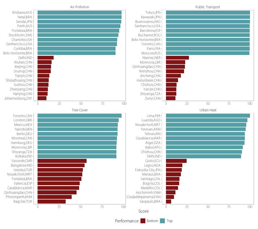
Figure 6. Top and bottom performers for four of the UESI issue categories based on average indicator scores.
6. Air pollution is one of the most dangerous environmental threats to human health in cities.
91 percent of people living in the UESI’s cities, compared to 90 percent globally, are breathing unsafe air that does not meet the World Health Organization’s guideline (10 micrograms per cubic meter) for safe exposure to fine particulate pollution. Generated through combustion, often from coal or car emissions, fine particulate matter (PM2.5) is small enough to lodge deep in human lung and blood tissue, contributing to health risks ranging from lung disease to stroke. 61 cities, including Oslo, Vancouver, Wellington, Anchorage, and Portland, demonstrate that better performance is possible: 100 percent of these cities’ neighborhoods have PM2.5 levels that fall within the World Health Organization standards.
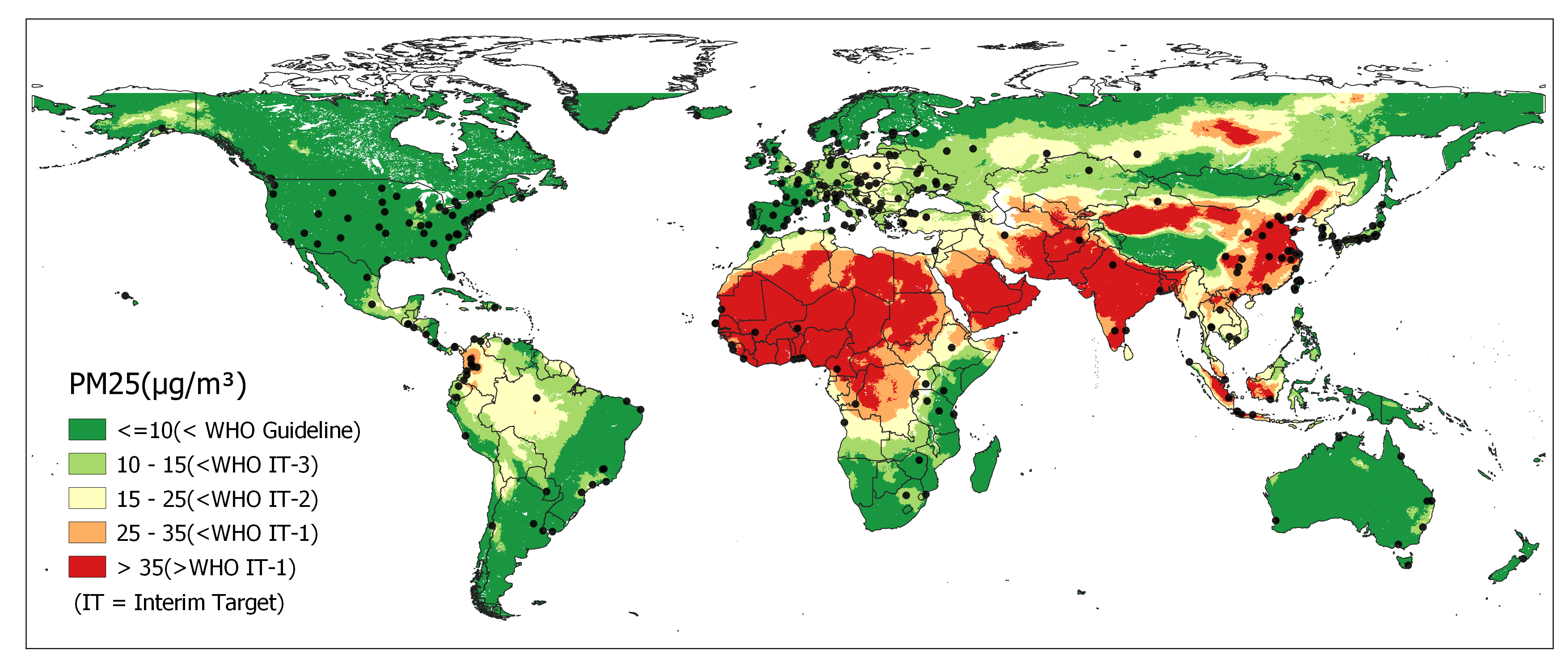
Figure 7. Global map of PM2.5 exceedances according to the World Health Organization (WHO) targets. (Data Source: The Global Annual PM2.5 Grids from MODIS, MISR and SeaWiFS Aerosol Optical Depth (AOD), 1998-2019, V4.GL.03).
7. Urban heat – Across the world, cities are placing the burden of urban heat on the poor.
The urban heat island effect – the temperature difference between an urban area and the surrounding rural area – is exacerbated in cities with lower tree cover or more built environment. Adding vegetation to neighborhoods can help offset urban heat, providing shade and evaporative cooling. The construction of built-up structures makes urban heat more intense by storing and trapping heat, and replacing vegetation that could otherwise help keep urban areas cool.
Exposure to urban heat, however, is not evenly distributed across all neighborhoods. 119 out of 282 cities across multiple continents are disproportionately burdening their lower-income citizens with higher levels of UHI exposure regardless of their performance in this indicator including cities like Qianhuangdao, China; Niamey, Niger; Mariupol, Ukraine; Madrid, Spain; Lima, Peru, San Francisco, US among others highlighted in red in Figure 8.
While cities across multiple countries and continents are burdening poorer populations with higher UHI, this challenge appears to be more prevalent in the US and Australia since over 80% of the cities evaluated in those countries are burdening their less affluent citizens with higher UHI exposure.
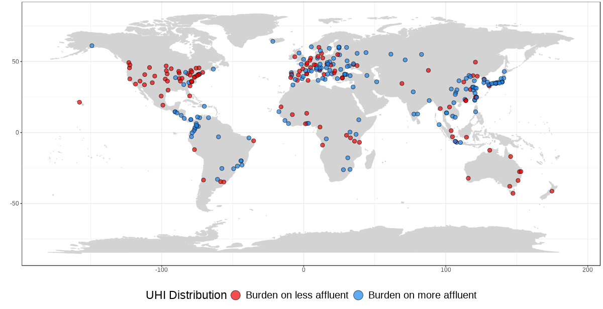
Figure 8. Most cities are placing the burden of the Urban Heat Island Intensity on the poor. The color of the dots indicates whether the less affluent or more affluent face disproportionately higher urban heat island intensity within a city based on the Concentration Index. Red cities indicate that the urban heat burden is placed on poorer citizens, while blue cities indicate that wealthier citizens bear a disproportionate share of a city’s urban heat.
8. Tree Cover – The UESI cities lost a total of 9,753.6 square kilometers of urban tree cover from 2000 to 2021 – an area more than 12.5 times the size of New York City.
The cities that have experienced the greatest loss in urban tree cover from 2000 to 2021 (using a 2000 baseline) include Vientiane, Laos, mainly in nearby humid forest due to urban and agricultural expansion; Coimbra, Portugal, which experienced a substantial loss of forests due to plantations in the outskirts of the urbanized areas; Perth, Australia due to increased urban areas in previously undeveloped land and loss in the nearby forested area; Porto, Portugal which lost some of its already small forested areas particularly to the east of the city and Fortaleza, Brazil which saw urban expansion throughout the city and loss of forest to the south. Figure 9 shows the cities with the highest proportions of tree loss during this period.
Vegetated space tends to be removed to make space for new developments and city infrastructure, especially in developing countries where cities are still increasing their footprint and building infrastructure as their populations increase.
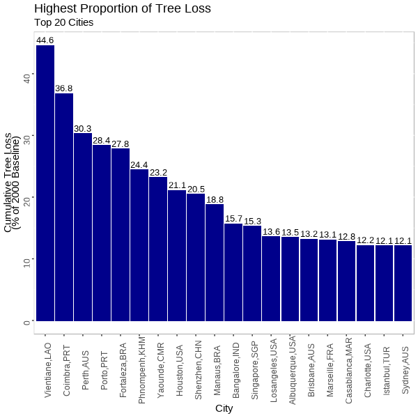
Figure 9. The 20 UESI cities with the highest proportion of tree loss from 2000 to 2021, relative to a year 2000 baseline.
9. Public Transit – Just over half of UESI cities (174 cities) on average have access to public transit within walking distance.
Walking distance is defined as 1.2 kilometers or 0.75 miles, the distance an average city resident is willing to walk to a public transportation stop. Cities like San Francisco, Barcelona, Buenos Aires, and Tokyo have public transportation stations that require a walking distance of less than 300 meters, while cities such as Chongqing and Chengdu in China, Kocaeli in Turkey, Wichita and Houston in the U.S., or Niamey in Niger require residents to walk an average distance of at least 5 kilometers (just over 3 miles) to reach a public transit station. More than half, or 174 of the 276 UESI cities with sufficient data to be evaluated on these indicators have public transit station access within 1.2 kilometers or less, no matter what neighborhood a resident is in. In most other cities, access to public transit can vary dramatically across different parts of the city. As we discuss in the Transportation profile , there are some limitations that should be considered when interpreting these results, particularly with respect to the source of transportation data used (OpenStreetMap) and the variable size of the neighborhoods.
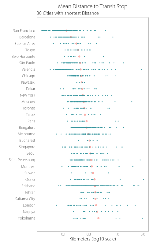
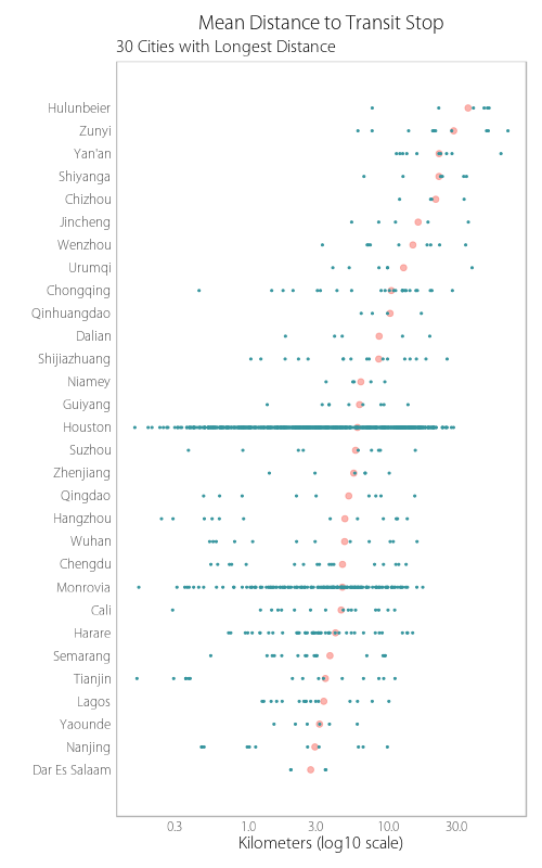
Figure 10. Mean distance to transit stops: Best 30 (a) and worst 30 (b) UESI cities by mean distance to public transportation.

