Overall Environmental Performance
Results for Pilot Cities
The Urban Environment and Social Inclusion Index (UESI) demonstrates a range of insights regarding the pilot cities’ performance on environment. Here we take a look at trends and drivers of urban environmental performance.
Chapter Authors
Andrew Feierman
Diego Manya
TC Chakraborty
Dr. Angel Hsu
Overall performance
The UESI pilot cities demonstrate a range of variation with respect to overall environmental results. We present several ways of diving into the UESI results within cities and across indicators, although the data and findings are best explored online through our interactive portal (www.datadrivenlab.org/urban). To compare how cities perform on average in all of the environmental indicators, we transform the raw data to a normalized scale of 0 to 100, with 0 being the worst performer and 100 the best (See Methods: Box 2: Measuring Environmental Performance – Proximity to Target). This normalization allows for comparison across both cities and indicators.
Trends across Indicators
As illustrated in Figure 1, cities generally perform well in the public transit access and water stress indicators and perform poorly in measures of wastewater treatment, climate change and air pollution. Scores in Proximity to Public Transit and Tree Cover per Capita are more narrowly distributed between 75 and 100, suggesting that most neighborhoods and cities in the UESI perform well on this indicators. For the Wastewater Treatment, Climate Policy, and PM2.5 indicators, the range of performance is much broader – some cities perform well on these indicators while others have much more room to improve. The range for the Water Stress indicator is much narrower due to the lack of neighborhood-scale data available for this indicator, which represents city-wide vulnerability to water availability.
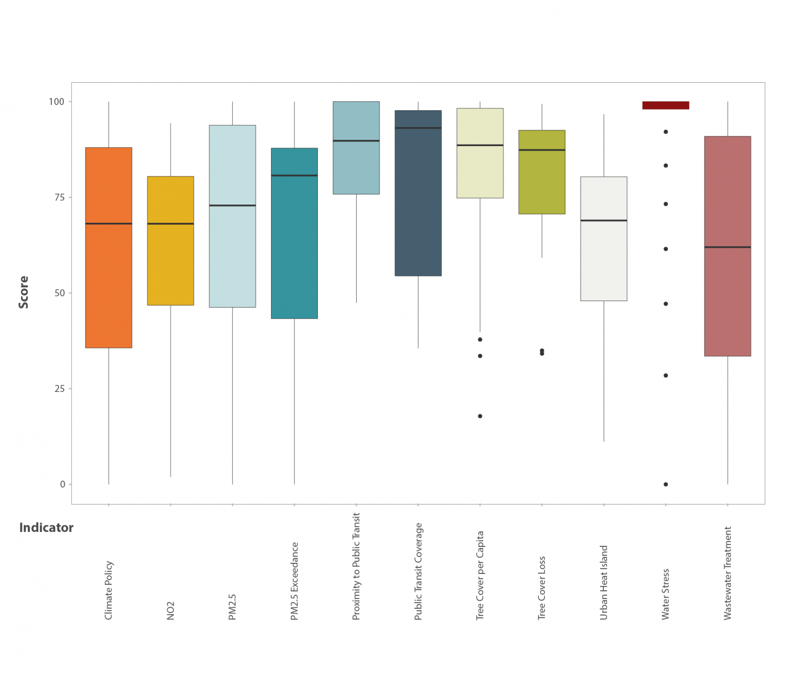
Figure 1: Summary proximity-to-target scores for environmental metrics captured by the UESI. The range of scores for the water stress indicator are more narrow than the other indicators due to its spatial resolution at the overall city scale rather than the neighborhood level.
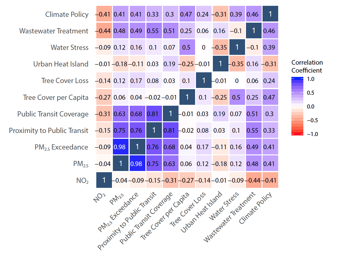
Figure 2. Correlation matrix that illustrates relationships between the UESI indicators. The more strongly positively related indicators (i.e., a high value on one indicator generally corresponds to a high value on the other) have values close to 1 (perfect correlation) and are shaded in blue, while the more negatively correlated indicators (i.e., a high value on one indicator generally corresponds to a low value on the other) are shaded in red and closer to -1 (perfectly negative correlation).
Many aspects of the natural and built environment are inextricably linked, and correlation between some environmental indicators used in the UESI is expected (Figure 2). A strong positive relationship exists between Tree Cover per Capita and Climate Policy, which suggests that cities that have outlined strong plans to tackle climate change mitigation and adaptation have also been successful at achieving goals for providing tree cover for their residents. The two sustainable public transit indicators are also fairly positively correlated with the air pollution metrics, indicating that cities who are performing well in providing public transit options have lower levels of air pollution. This pattern makes sense, as public transit reduces reliance on personal automobiles and reduces congestion that would intensify local urban air pollution.
Trends across cities
Although the UESI does not provide an overall ranking of cities’ environmental performance due to challenges with respect to varying levels of development for each city, we present Figures 3 and 4 as ways to summarize cities’ scores on each of the 10 indicators. This illustration is meant to show which indicators cities perform well in, relative to other indicators. Melbourne, for instance, performs less well on the wastewater treatment and urban heat island indicators, while Copenhagen performs among the best in terms of wastewater treatment. This figure provides a snapshot comparing cities’ performance in each category, and provide an indication of their overall performance. It also brings attention to where there are gaps in data for cities. The data source for water stress lacks data on Atlanta and Bangalore. Tel Aviv, Casablanca, Ho Chi Minh City, Delhi, Bangalore, and Lima all receive a score of 0 for climate policy because no evidence of a city-level climate mitigation or adaptation policy could be located (See the Climate Change issue profile for more details on how we scored cities on this indicator).
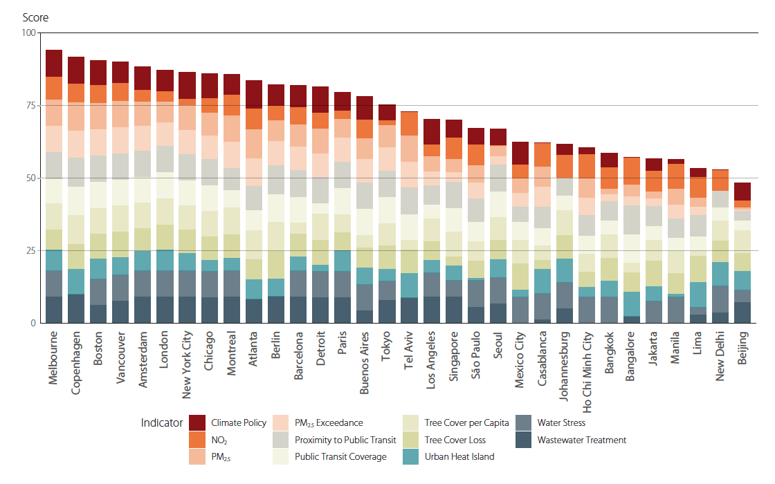
Figure 3. UESI Cities ordered by a simple average of their proximity-to-target environmental score on each of the 10 environmental indicators. A city’s overall score is calculated by taking the proximity-to-target score of each metric and dividing by the number of metrics available for a given city.
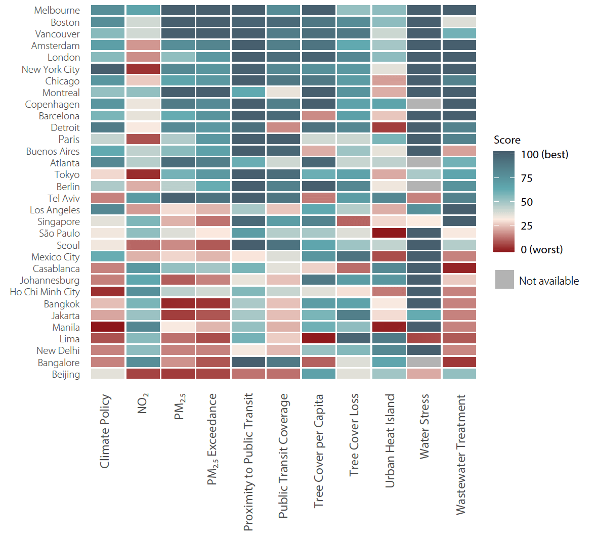
Figure 4. A heat map of the pilot UESI’s proximity-to-target scores by UESI indicator. Blue indicates higher performance, while red indicates poor performance. Some cities are missing data for the water stress indicator and are shaded as gray.
Box 1. Physical characteristics of cities
The physical characteristics of a city can influence its environmental performance. A city’s form and layout, built environment, density and compactness, elevation, and fabric all play a role in determining differences in environmental performance. Some of these measures, such as elevation, are physical features or natural endowments that are not influenced by policy or anthropogenic causes. Our analysis of urban environmental performance includes several variables that evaluate the physical characteristics of cities or other properties, such as population density and standardized income per neighborhood. Data to assess these attributes are derived either from reported census information or from satellite images. We include these physical attributes to understand potential underlying drivers of urban environmental performance. While there are some characteristics cities have no control over (e.g., elevation), there are others relating to urban form that cities’ planning and design decisions can influence. The Journal of the American Planning Association in 1997 featured a now iconic debate between two camps of planners: those like Peter Gordon and Harry Richardson, who argued that sprawl reflect consumer preferences, and those like Reid Ewing who advocate compact cities as a more desirable alternative. But for urban sustainability, what do these camps say about which is a solution for environmental issues? An active debate has explored whether compactness and density can provide a solution for environmental challenges such as access to urban services and reduction of greenhouse gas emissions.
| Characteristic | Description |
| INCOME_STD | Average income, standardized to US dollars |
| DENSITY | Population density in thousands per sq. km |
| ALBEDO | Average surface reflectance. Satellite-derived. Albedo measures the amount of incoming light that is reflected off the surface, and both weather and development patterns influence it within a city. Sunlight is absorbed by darker colors, so climates with brighter colors tend to have lower albedo. Cloud cover, common construction materials, and soil composition all contribute to the albedo of a given city. |
| ELEVATION | Average elevation of neighborhood. Satellite-derived. |
| NDVI | Normalized difference vegetation index. Satellite-derived. A measure of surface greenness. |
| NDBI | Normalized difference built-up index. Satellite-derived. A measure of how much an urban area is built up. |
| TREEPROP | Proportion of an entire city or neighborhood that is covered by tree cover. Satellite-derived. |
| Table 1: Physical Characteristics in the UESI. In this chapter, values for physical characteristics have been scaled to have values ranging from 0 (minimum) to 1 (maximum) for analysis. This transformation is done to make it easier to compare relative differences between indicators. |
Both compact and sprawl are loaded terms, but there are characteristics of compactness and sprawl that urban planning literature can agree on. The key attributes of a compact urban form include: 1) dense and proximate development patterns, 2) neighborhoods linked by public transport systems, and 3) accessibility to local services and jobs. On the other hand, the term sprawl usually equates to three prototypes: 1) leapfrog and scattered development patterns, 2) transportation dominated by privately owned vehicles, and 3) spatial segregation for different land uses. This debate, often situated in a developed country context, like the United States, where the notion of sprawl first emerged, can be generalized as: proponents of sprawl argue there is no clear evidence that high-density development would lead to reduced energy consumption, and technological advancement can mitigate increased emission. On the other hand, some scholars claim that compact urban forms, with increased efficiency in resources usage, do have effects on improving air quality, reducing energy consumption, and mitigating climate change. Transportation provides one concrete example of this debate between compactness and sprawl. Would a compact city lead to less Vehicle Miles Traveled (VMT), a common metric of a compact city that suggests overall lower energy consumption from commuting, and therefore reduced transportation emissions? There is no short and clear answer to this question, and the evidence is complicated. For instance, in the U.S. context, Ewing and Cervero found that population and job density had the smallest impact on VMT, suggesting a compact form does not necessarily reduce how much people drive. Byproducts of dense urban forms, such as public-transit job accessibility, however, demonstrate an impact on lowering VMT, suggesting that the distance between where people live and work may be the key determinant of this indicator. A recent paper by Stokes and Seto (2018) demonstrated trade-offs between increasing the accessibility of employment opportunities and social equity, finding that most U.S. cities that have increased job accessibility have not accomplished this goal in a way that reduces emissions.
Typologies of Urban Environmental Performance
Exploring how cities tend to group together when measured across the UESI indicators can shed light on the similarities or dissimilarities in their environmental performance. We developed a typology to describe how similarly cities perform using a statistical approach called k-means clustering, which identifies groups within data based on how similar data points are to each other with a pre-defined number of “k” clusters. Although there is no exact method for determining the optimal number of clusters, the general technique is to determine the number of clusters that minimizes the distance between the cluster averages and the data points. For the UESI cities, this optimal number was six clusters. Figure 5 and Table 1 describe these 6 clusters in more detail and explore common elements across the cities’ environmental performance and physical characteristics.
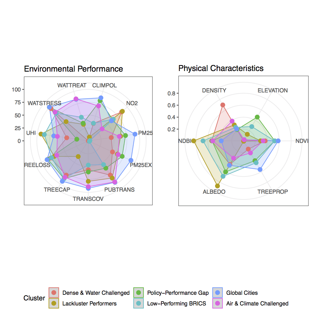
Figure 5. Two plots show the average score of each cluster’s performance across the UESI’s environmental indicators (left) and physical urban features (right). Environmental indicators are scaled 0-100, with 100 representing the top performance benchmark. Physical indicators are also scaled 0-1, though a higher score is not necessarily better for physical features.
Dense & Water Challenged
(Bangkok, Ho Chi Minh City, Jakarta, Manila)
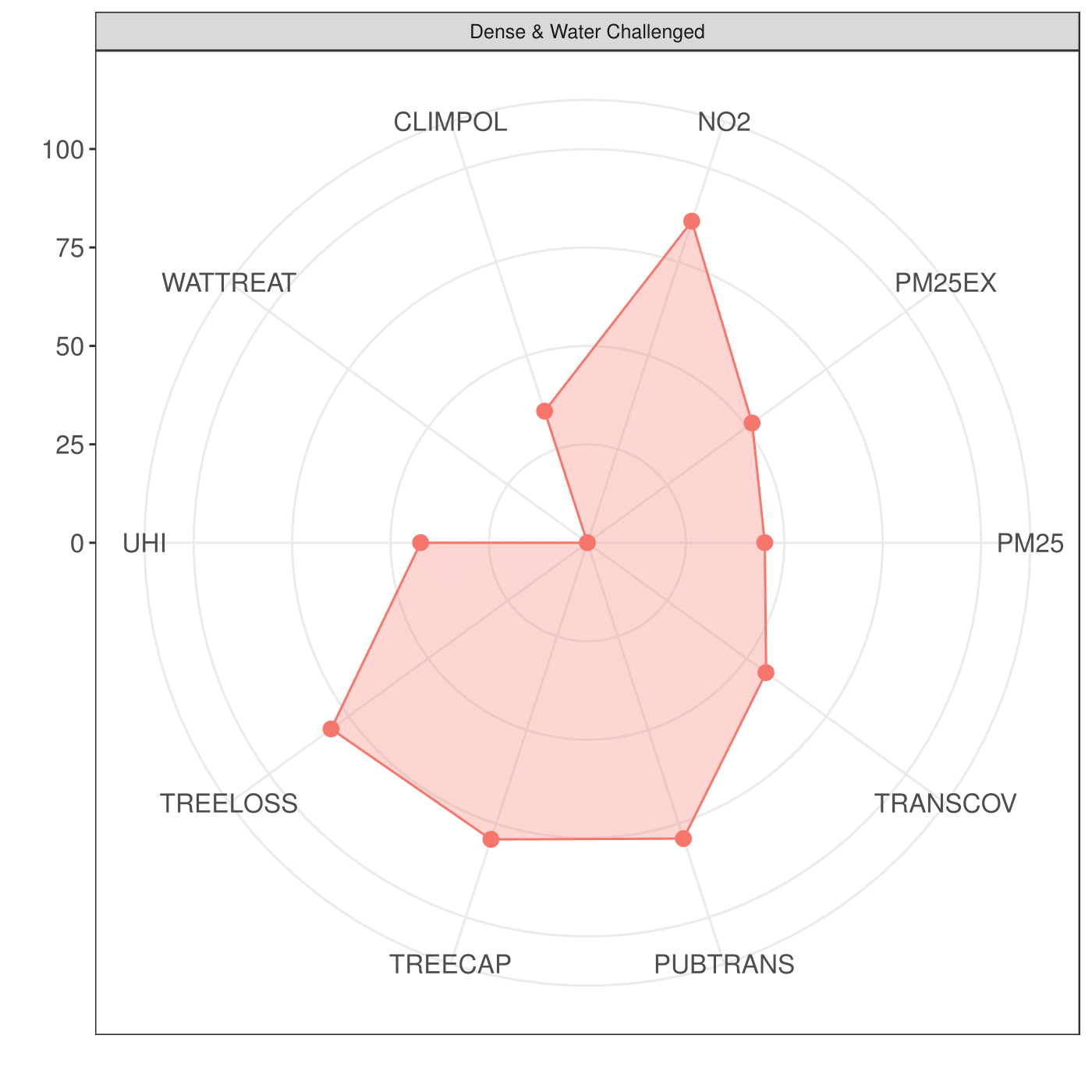
This cluster contains four large, dense cities in Asia. Along most metrics, these cities perform at close to average levels. They distinguish themselves due to high levels of fine particulate air pollution, as indicated through low performance on the PM2.5 (45) and PM2.5 Exceedance (52) indicators, and the worst wastewater treatment scores in the UESI sample. These cities also stand out as containing the highest density of all clusters. These cities have all experienced rapid growth and developing in recent history.
Rapid urbanization and development have strained existing water infrastructure, which may explain this cluster’s low performance on wastewater. In Bangkok, a series of natural disasters in the early 2010s damaged infrastructure already in need of significant maintenance. To address this challenge, the Thai government has recently come out with a series of development plans aimed at dramatically upgrading water infrastructure by 2026. 1 In Jakarta, long-running debates and lawsuits surrounding the privatization of water resources stall the long-term development of infrastructure. Recent developments suggest a larger role for the state to provide clean water throughout the city, including significant investment into poorer areas that have been chronically underserved. 1
Low-Performing BRICS
(Beijing, Johannesburg, New Delhi)


This cluster contains 3 of the 4 cities in our dataset from the BRICS (Brazil, Russia, India, China and South Africa) emerging economies. These cities are all major economic hubs in countries that have experienced rapid growth in the past 30 years. Perhaps as a result of this growth and increased economic output, these cities cluster together due to their extremely poor levels of airborne particulate matter (PM2.5: 3).
Although UESI cities in general perform well on the public transit indicators across the board (see Figure 1), the cities in this cluster have the lowest public transportation access of any cluster. With the early stages of industrialization achieved, the governments of these cities are slowly investing in public transit, with Beijing adding more than 20 lines since 2002 and now boasting the highest ridership of any mass transit system in the world with more than 10 million riders each day.
While these investments in public transit are encouraging, the overall extent of Beijing’s urban area is the reason it performs poorly on these indicators – some areas completely lack public transportation options due to low density or low built environment.
Despite performing poorly on the climate policy indicator, with New Delhi receiving a score of 0 for failing to have any city-level climate action plan, these cities perform well according to urban heat island and measures of tree cover. This result, however, may be somewhat skewed by certain primarily forested and rural neighborhoods in Beijing, which cover a significant area outside the municipal limits (for more, see Box 3: Challenges in Evaluating Beijing’s Large Urban Extent).
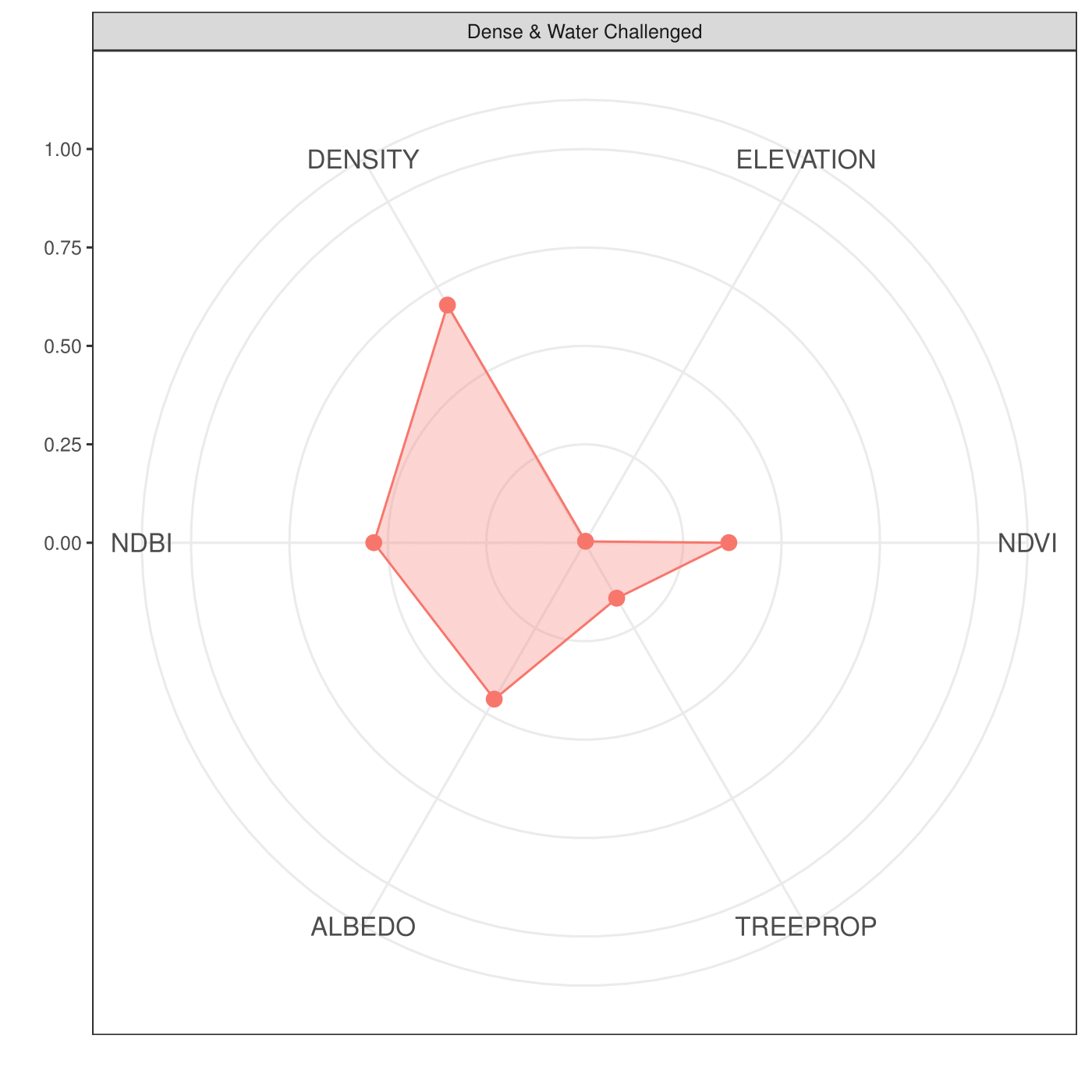
Lackluster Performers
(Lima, Casablanca, Bangalore, Tel Aviv)
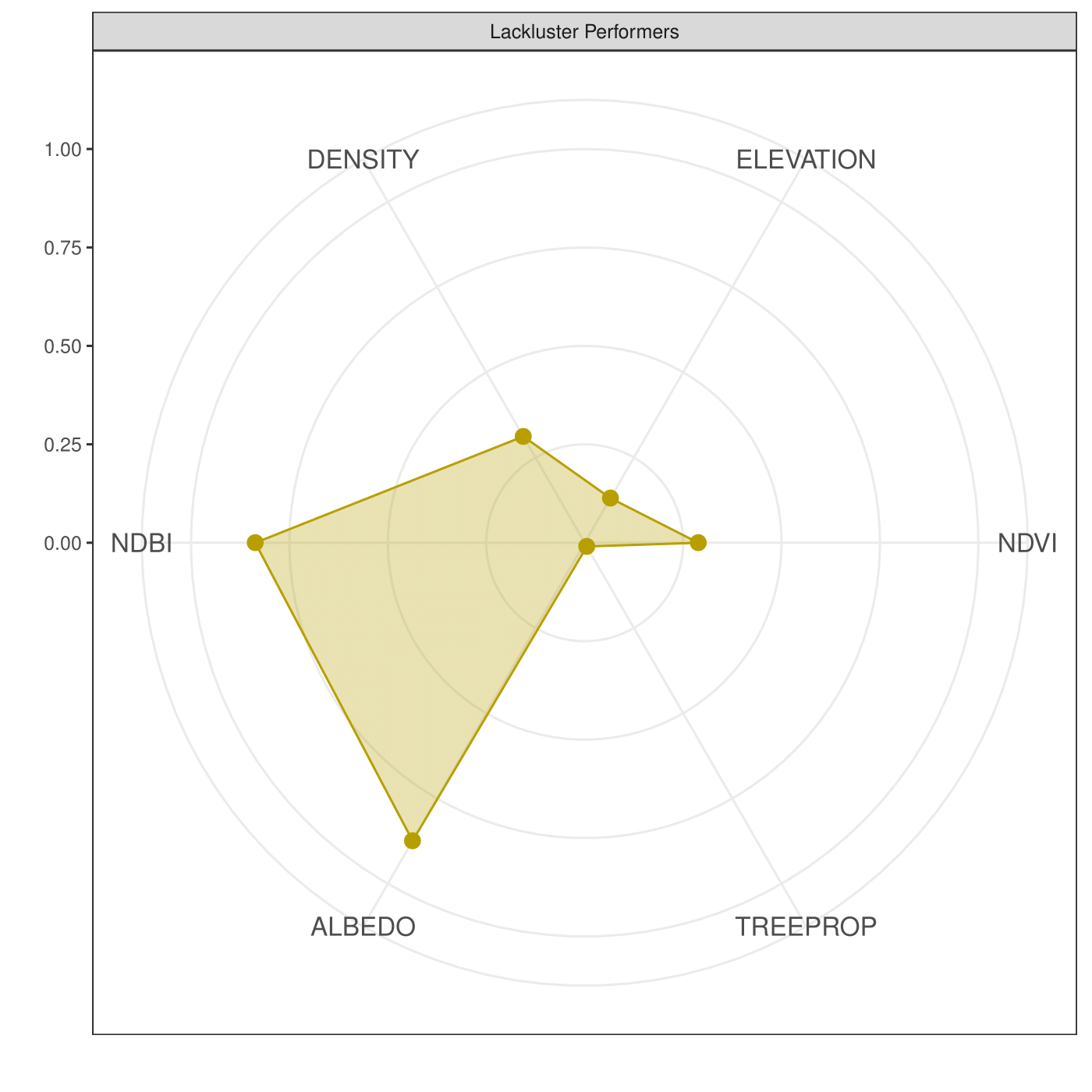
The cities in the Lackluster Performers cluster are diverse in their geography, size, and economic development. They perform well across some measures, including the highest aggregate performance for NO2 (88) and urban heat island effect (93), despite having low levels of tree cover and being relatively built up (measured via NDBI). Lima is a clear laggard in the cluster across a number of environmental metrics. The city’s poor fuel quality, a car and bus fleet over 20 years old, combined with the city’s geography between the Andes to the East and the Pacific Ocean to the West, give the city what one World Health Organization study found to be the worst PM2.5 levels among Latin American cities. 1 1
The environmental performance of cities in this cluster may be due in part to a physical feature of the cities, albedo. This group has the highest albedo levels of any cluster by a large margin, which could explain why cities in this group perform well on urban heat island effect despite low levels of tree cover. These high albedo levels are likely due to this cluster’s high built-up area (NBDI: .84), as structures built of concrete tend to have higher reflectance than natural land covers, such as forest or grassland.
Another notable characteristic of this cluster that distinguishes it from others is the lack of urban climate policies in many of these cities. Bangalore is another city, along with Delhi, that lacks a climate action plan, due to a myriad of reasons that involve both the lack of local authority and capacity to effectively coordinate across departments and ministries to address climate change. While Karnataka, the province within which Bangalore is located, does have a state action plan for climate change, critics have pointed to its failure to appropriately mainstream climate change into development concerns.
Global Cities
(New York City, Boston, Montreal, Atlanta, Berlin, Chicago, Melbourne, Vancouver, Amsterdam, Copenhagen, Barcelona, and London)
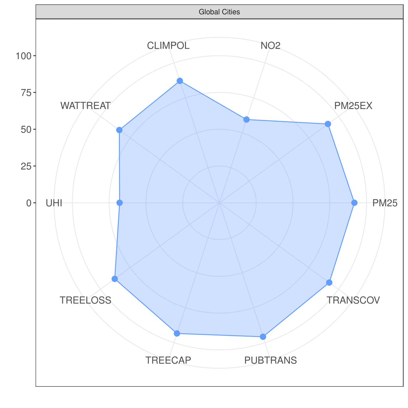
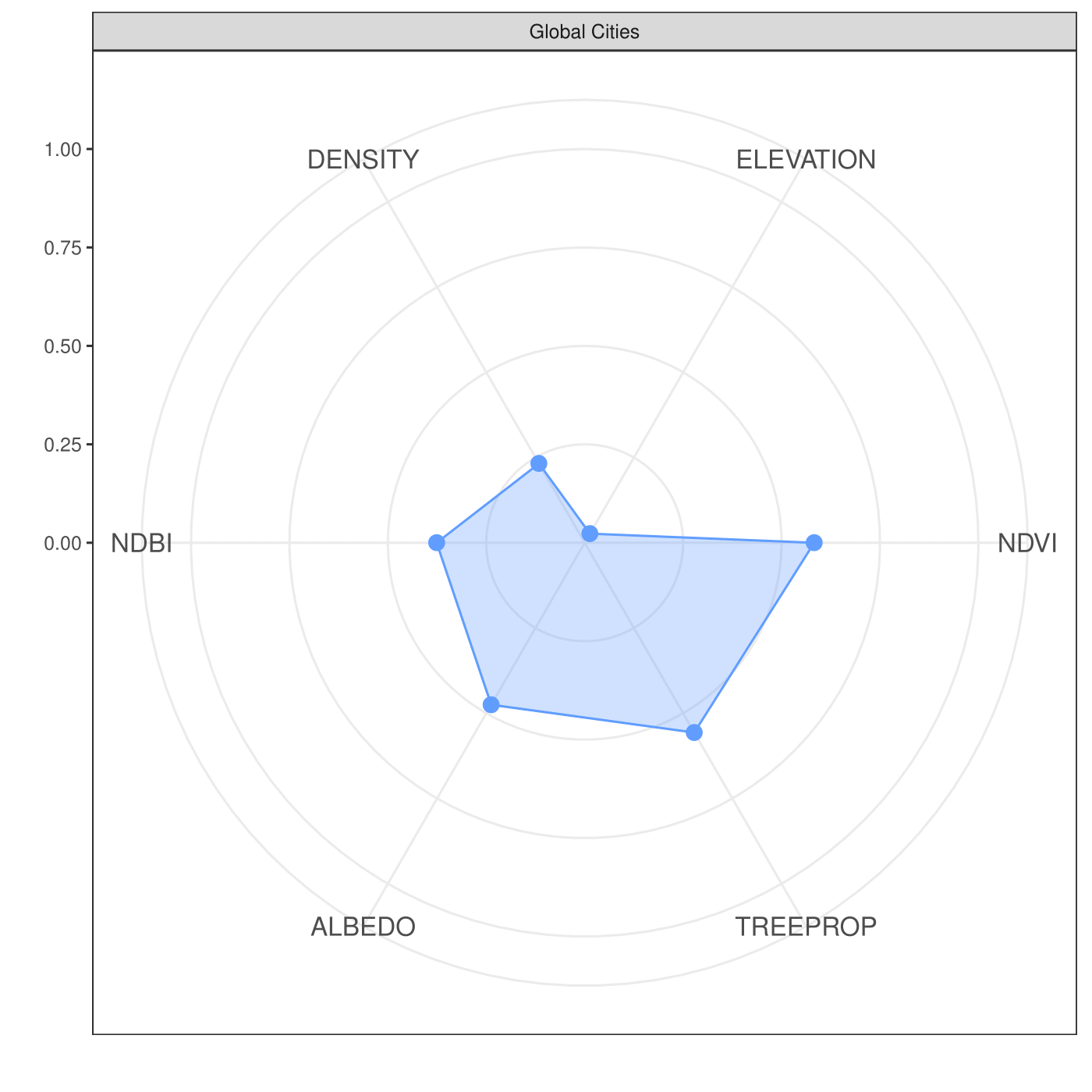
The global cities cluster has the most cities, most of which are are located in countries with high levels of economic development. Many of these cities are capital cities in their respective countries, with all frequently identified as “global cities” according to world rankings and lists, such as A.T. Kearney’s Global Cities Index, which recognizes these cities for having a favorable mix of business activity, human capital, information exchange and political engagement to thrive. 1 From an environmental perspective, these cities are characterized by high levels of tree cover per person, strong public transit access, and low levels of PM2.5.
While most of these cities are in countries that have long-standing federal policies limiting air pollutants, performance is mixed with respect to the air indicators. These cities generally perform well on the particulate matter indicators (PM2.5: 92) but display mediocre performance on NO2. National legislation such as the U.S.’s Clean Air Act in America or Australia’s National Clean Air Agreement have likely contributed to these cities’ high performance on PM2.5. However, performance on the NO2 indicator is amongst the lowest for this cluster (NO2: 60). Low scores on NO2 are likely due to the persistence of diesel vehicles in many developed country cities. Earlier this year, Germany banned older diesel vehicles from their roads and sales of these vehicles have already dropped 25 percent. 1
Air & Climate Challenged Cities
(Tokyo, Paris, Seoul, Singapore, Los Angeles)
This cluster contains large, (mostly) capital cities that perform fairly poorly on urban heat island (61), climate policy (70), and air quality indicators (NO2: 35, PM2.5: 61, PM2.5 Exceedance: 64).
Poor air quality is an issue throughout densely populated South Korea, particularly in its capital city of Seoul, and the country was determined to have the worst air quality of any OECD (Organisation for Economic Co-operation and Development) member state as recently as 2017. The public perceives the real risk of poor air quality, as one study claimed South Koreans fear poor air more than the risk of nuclear weapons being used on the Korean Peninsula. Shifting transportation modes from vehicles to public transit is an effective way to improve air quality, and to try to initiate this shift, Seoul’s government has experimented with making public transportation free within the city. 1 Seoul also suffers from regional air pollution problems due to its proximity to China, which has struggled with its own air pollution problems. 1
Due to high transit-related air pollution emissions, these cities have invested in mass public transit, which is evident through their strong performance on the public transportation indicators (Proximity to Public Transit: 95, Public Transit Coverage: 89). All of these cities were listed in 2017 for having “the world’s best metro systems.” 1 Tokyo’s mass transit system, for instance, covers more than 120 miles and is a model for how privatized systems are effective at providing mass transit. 1
These cities also perform well on tree cover per capita, mostly due to Singapore’s extensive tree cover. Singapore, the best performer for tree cover among any city in the UESI pilot cities, shows how policies can lead or aid environmental performance. The Singapore National Parks Board (NParks) has a policy to replace any vegetation that is displaced as a result of construction, which results in preservation of green space throughout the city-state. Vertical gardens and green roofs are also subsidized through Singapore’s Skyrise Greenery Incentive Scheme 2.0. 1 These efforts to improve tree cover in Singapore have worked, as the city-state ranks highest in measures of tree cover, despite clearing significant amounts of green space for development, including construction of an airport, over the past 20 years.
Box 2. Challenges in Evaluating Beijing’s Large Urban Extent
What defines a city? While local governments set administrative boundaries to define city limits, distinguishing between urban and non-urban, rural from suburban, and everything in between is so challenging that most scholars simply refer to the “rural-urban continuum” to recognize that these categories are not so clear cut. The UESI also wrestled with this issue (see Methodological Appendix), given the variable definitions and boundaries cities adopt when delineating their urban extents.
While our analysis revealed urban and neighborhood definitions between cities were generally comparable, Beijing stood out for its large urban extent and diverse neighborhoods, with some neighborhoods surrounding Beijing’s urban core — the densely-populated area within the capital’s sixth ring road and centered around the famous Forbidden city — primarily forested, rural and with few residents. To illustrate this point, we used satellite analysis of land cover to compare the size of neighborhoods (n=2,107) within the UESI cities and whether they were primarily urban or rural (Figure 8). Compared to other cities, Beijing’s neighborhoods are much larger and show a range of variation in terms of the number of urban pixels in each, suggesting that some neighborhoods in the bottom right of the plot are primarily rural and very large in overall area.
Figure 9. Size of neighborhoods within the UESI dataset and the number of urban pixels within them.
While we considered removing neighborhoods from Beijing that contained a low ratio of urban to non-urban pixels, removing certain neighborhoods from Beijing would required a similar consideration for other neighborhoods in other cities. Determining an appropriate threshold for exclusion would have been challenging. After conducting a sensitivity analysis (see Methodological Appendix), we determined Beijing represented an outlier that would have unduly influenced the other results and decided to not include Beijing in the PCA analysis.
Examining Variation in Environmental Performance within Cities
One approach to understanding variation in environmental performance is through principal component analysis or PCA, a statistical method that takes many different variables and identifies those that are most critical to explain variation within the original data. Applied to the UESI cities, this technique can help to isolate some drivers explaining differences in environmental performance at both the city and neighborhood scale. Combining both data on physical characteristics of cities and environmental performance on the UESI indicators, we can see what factors contribute most to variation in cities’ scores. Figure 6 displays the six city clusters above along the first two principal components, which explain around 60 percent of the variation in environmental performance within the cities. This illustration presents a clear picture of how similar and dissimilar various clusters are: the Global Cities (e.g., New York, Montreal, Atlanta, etc.) and the Air and Climate-Challenged Cities (e.g., Tokyo, Seoul, and Paris) show some overlap in their performance, with the latter cluster more strongly explained by the first principal component.
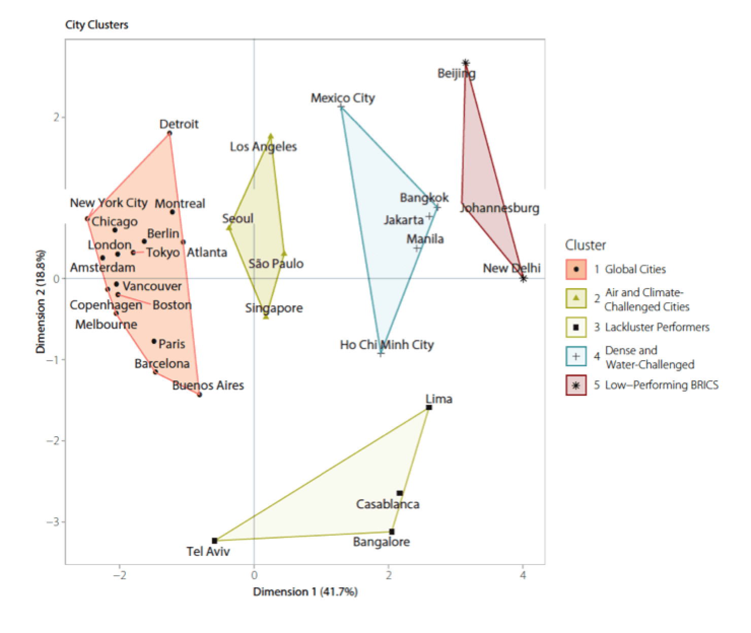
Figure 7. UESI cities clustered (using k-means clustering algorithm) according to their proximity-to-target scores. City clusters are displayed along the first two principal components, which explain most of the variation in the city scores (40.6% of the variation in dimension 1, and 19.2% of the variation in dimension 2, for a total of 59.8%).
City-scale analysis of principal components
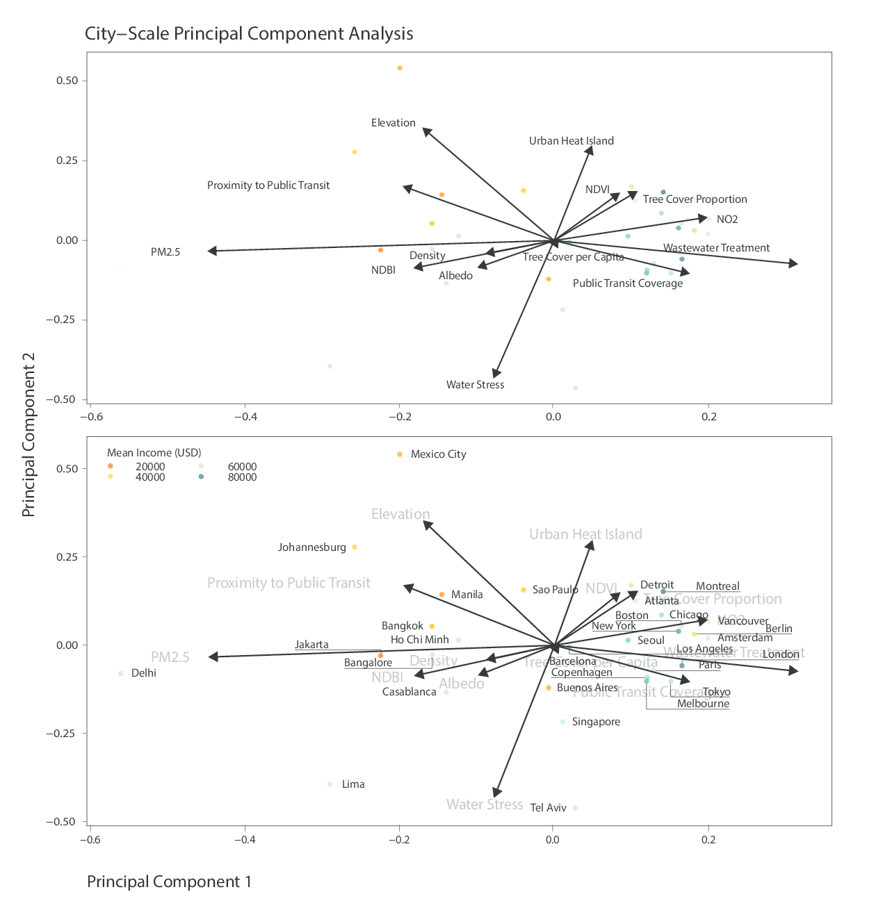
Figure 7. First two principal components for indicators and city-level performance. Panel a) shows the UESI indicators plotted along the first two principal components, while panel b) has the UESI cities plotted on top. Note: Beijing is excluded from this analysis (see Box 2: Challenges in Evaluating Beijing’s Large Urban Extent).
Figure 7 provides a juxtaposition of two principal component analyses at the city-scale: panel a) highlights the environmental performance and physical characteristic indicators, while panel b) features the UESI cities on top. The first two PCAs explain around 56 percent of the variability within cities, with the first principal component having strong negative associations with PM2.5 but strong positive associations with wastewater treatment.
Delhi stands out as a city that has strong strong negative associations with PM2.5, which is unsurprising given the city’s last-place performance on this indicator. Developed country cities like Tokyo, London, Amsterdam, Berlin, Vancouver, Paris are all clustered near the vector for Wastewater Treatment and NO2, and Transportation Coverage, which all have positive associations within PC1. In general, developed-country and developing country cities are nearly equally split according to PC1: developed-country cities primarily have positive associations with PC1 and developing-country cities are located on the left-hand side of the PC1 axis.
Neighborhood-scale analysis of principal components
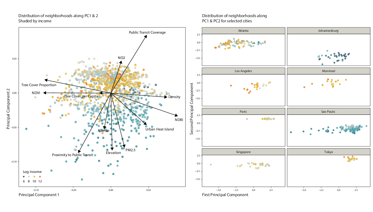
Figure 8. Neighborhoods within selected cities plotted along the first 2 principal components shaded by logged income (GDP per capita) levels. Note: Beijing is excluded from this analysis (see Box 2: Challenges in Evaluating Beijing’s Large Urban Extent).
Applying a PCA to the neighborhood level (n=1,354) reveals a general division of performance along income levels. Figure 8 illustrates the application of a PCA to neighborhoods with complete environmental performance data, shaded according to income per capita. For higher-income neighborhoods (around $160,000 USD per capita; shaded in red), most of the variation in scores is driven by positive associations with public transportation coverage, greenness (NDVI), and tree cover proportion. Lower income neighborhoods (less than $3,000 USD per capita; shaded in blue-green) tend to fall on the right-hand side of the PCA plot in Figure 7, with negative associations with PM2.5 and built environment (NBDI) explaining most of the variability in those cities’ results. The right-hand panel of Figure 8 provides more detailed views of where cities fall within the overall PCA plot. While neighborhoods within a city tend to cluster together, within city clusters some neighborhoods display varying levels of income, which is particularly evident in Sao Paulo and Atlanta, although the log transformation has the effect of downplaying some of these differences in income.