Issue Profile
Transportation
Public transportation infrastructure (e.g., rail, mass transit, and bus) enable people to move across a landscape, connects residential areas with work and recreational opportunities, and is a central aspect of urban and regional planning.
Chapter Authors
Ryan Thomas
Sophie Janaskie
Ross Rauber
Saskia Comess
Xuewei Wang
Diego Manya
We score cities on two indicators for Sustainable Public Transportation:
1. Proximity to Public Transit (PPT): the proximity of a public transportation stop to where people live in an urban neighborhood. This indicator is represented as the mean distance required for residents to reach a public transit stop. The mean distance required for residents to reach a public transit stop is weighted by the neighborhood’s residential population density.1Further work is needed to integrate the proximity of transit stops to work opportunities, as residences and work opportunities make up two ends of the daily commute.
2. Public Transportation Coverage (PTC): the ratio of area within walking distance to a public transportation stop for each neighborhood. PTC measures the ratio of neighborhood area within walking distance to a transit stop. Transportation planning guidelines frequently define walking distance in quarter-mile or 400-meter increments 2El-Geneidy, A. et al. (2014). New evidence on walking distances to transit stops: identifying redundancies and gaps using variable service areas. Transportation, 41(1): 193-210. 3The algorithm used here calculates the circular buffer, rather than the network buffer. Oliver, Schuurman, and Hall (2007) suggest that network buffers will generate significantly different results from the circular buffer when calculating walkability based on land use. While their focus is slightly different, assessing the “walkability” of a neighborhood based on the land uses surrounding pedestrian paths, proximity to public transportation values will also differ if based on the road network rather than the circular buffer. These values would be more in line with an indicator such as accessibility as described in the box on An alternative dataset for measuring public transit on the UESI online portal. 4Daniels, R. & Mulley, C. (2013). Explaining walking distance to public transport: The dominance of public transport supply. The Journal of Transport and Land Use, 5(2): 5-20. and assume that people will walk farther to access transit of higher speeds and greater reliability, regardless of the mode. However, we use mode here as a proxy for more general qualities of urban transportation.5Daniels, R. & Mulley, C. (2013). Explaining walking distance to public transport: The dominance of public transport supply. The Journal of Transport and Land Use, 5(2): 5-20. The PTC ratio is based on buffers with a radius of 420 meters (approximately 0.25 miles) for bus stops and 1.2 kilometers (approximately 0.75 miles) for train stops, to reflect this difference.6While most urban planning literature cites a ”catchment zone“ (i.e., a geographic area encompassing all possible riders for a mode of public transit) of 0.25 to 0.5 miles (0.4 to 0.8 km), Durand et al. (2016) found in a survey that riders express willingness to travel further. We therefore adopted a target of 1.2 km.“ Durand, C. P., Tang, X., Gabriel, K. P., Sener, I. N., Oluyomi, A. O., Knell, G., … & Kohl III, H. W. (2016). The association of trip distance with walking to reach public transit: data from the California household travel survey. Journal of transport & health, 3(2), 154-160.
Additionally, we provide a City-wide Proximity to Public Transit (CPPT) measure (see Table 2) for the UESI pilot cities, to summarize whether a city-wide average measure of proximity to public transit takes into consideration more densely populated neighborhoods that have greater access to public transit than less densely populated areas. For a discussion of alternative methods we explored to calculate Sustainable Public Transit, see the boxes on Limitations of the data and indicators, Alternative Method: Disaggregating Population and Alternative Method: Transit Accessibility (Applied to Singapore).
The Sustainable Development Goals (SDGs) identify the improvement of public transit as key to address climate change and development. Sustainable Development Target 11.2 calls for “safe, affordable, accessible and sustainable” public transit to help deliver resilient and inclusive cities. The US transportation sector, for example, has historically been one of the largest carbon-emitters due to personal automobile use. In 2015, the U.S. transportation sector contributed 27 percent of the country’s greenhouse gas emissions.7United States Environmental Protection Agency, “Fast Facts: U.S. Transportation Sector Greenhouse Gas Emissions,” 2015, Retrieved from: https://nepis.epa.gov/ Exe/ZyPDF.cgi?Dockey=P100S7NK.pdf. In conjunction with policies, such as congestion pricing, that directly disincentivize driving personal automobiles, urban administrations can provide convenient public transportation options to encourage alternatives to personal automobiles.
Public transport also contributes to social inclusion in communities.8Gobillon L., & Selod H. (2014) Spatial Mismatch, Poverty, and Vulnerable Populations. In: Fischer M., Nijkamp P. (eds) Handbook of Regional Science. Springer, Berlin, Heidelberg Transportation connects populations within a city, providing access to essential services, such as schools, grocery stores, and health facilities, job sites, and recreational facilities. Recognizing the importance of public transportation for both environmental and social inclusion goals, many city governments have set goals for public transportation availability.
The locations of bus and train stops and of green spaces are the only data needed to compute the Sustainable Public Transit indicators. For all selected cities, transit stop locations were downloaded from OpenStreetMap (OSM), queried using the OpenStreetMap OverPassAPI (see Table 1 for the specific OpenStreetMap “tags” considered to be relevant). OSM is a crowdsourced map of the world that has grown in coverage and quality since its inception in 2006, 9Haklay, M. (2010). How good is volunteered geographical information? A comparative study of OpenStreetMap and Ordnance Survey datasets. Environment and planning B: Planning and design, 37(4), 682-703. 10Sehra, S. S., Singh, J., & Rai, H. S. (2017). Using Latent Semantic Analysis to Identify Research Trends in OpenStreetMap. ISPRS International Journal of Geo- Information, 6(7), 195. 11Yagoub, M. M. (2017). Assessment of OpenStreetMap (OSM) Data: The Case of Abu Dhabi City, United Arab Emirates. Journal of Map & Geography Libraries, 13(3), 300-319. with some researchers predicting that some OSM data will be available on every square kilometer of the Earth’s surface by 2020. 12Arsanjani, J. J., Zipf, A., Mooney, P., & Helbich, M. (2015). OpenStreetMap in GIScience. Lecture Notes in Geoinformation and Cartography. Still, the quality of OSM data depends on volunteer mappers, and the SPT indicator’s accuracy is limited by the quality of OSM data.
To calculate the Proximity to Public Transit (PPT) indicator, the mean distance to a transit stop within each neighborhood was computed. The locations of green spaces, also gathered from OSM, were masked out of the neighborhoods to more accurately represent where residences may be located. The distances represent the shortest distance from 100 randomly located points in each neighborhood to the nearest public transportation stop within the whole urban area. Figure 4 shows an example of this in Beijing. (The pilot version of the UESI used a slightly different methodology, determining the median distance — rather than mean distance — to a transit stop).
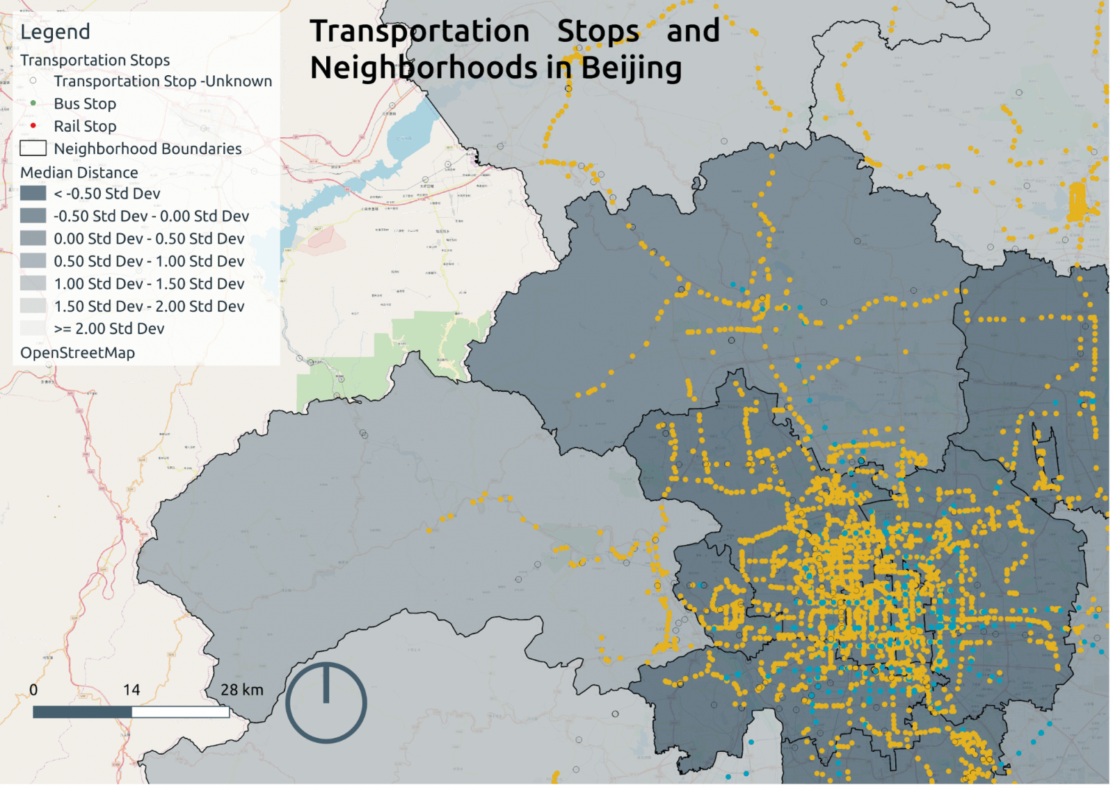
Figure 4: Distance to public transit in Beijing’s municipal subdivisions, with density of subdivisions shown in gray scale (lighter colors are more dense). Data source: OpenStreetMap.
To calculate the Public Transportation Coverage (PTC) indicator, we placed a buffer of 420 meters around each bus stop and 1.2 kilometers around each intra-city rail stop. We then dissolved these buffers to create a GIS layer designating the area proximate to a transit stop. The proximate area was compared to the neighborhood’s area to calculate the percentage of a neighborhood covered by public transit. Figure 5 below shows the locations of transit stops as points on a map of Amsterdam. The green shading indicates areas within the walkshed of transit stops, and the grey shading indicates the neighborhood boundaries. Gaps in neighborhoods represent waterways and areas outside the city limits.
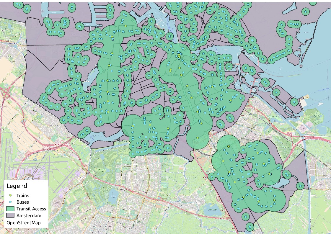
Figure 5. An illustration of the Public Transit Coverage layer in Amsterdam. We excluded park areas from the area calculation for both the buffer and the total neighborhood calculation.
| Transit type | OpenStreetMap definition |
| Bus | A form of public transport that operates mainly on the road network |
| Train (rail/mainline) | Full sized passenger or freight trains in the standard gauge for the country or state |
| Subway | A city passenger rail service running mostly grade-separated (defined as a method of aligning a junction of two or more surface transport axes at different heights so that they will not disrupt the traffic flow on other transit routes when they cross each other) |
| Tram | City-based rail systems with one/two carriage vehicles, which often share roads with cars |
| Metro | A rapid transit train system |
| Light Rail | A higher-standard tram system, normally in its own right-of-way |
Table 1. Definitions of Transit Queried from OpenStreetMap
For Proximity to Public Transit (PPT), the target median distance to a public transportation stop is 1.2 kilometers. 13While most urban planning literature cites a ”catchment zone“ (i.e., a geographic area encompassing all possible riders for a mode of public transit) of 0.25 to 0.5 miles (0.4 to 0.8 km), Durand et al. (2016) found in a survey that riders express willingness to travel further. We therefore adopted a target of 1.2 km.“ Durand, C. P., Tang, X., Gabriel, K. P., Sener, I. N., Oluyomi, A. O., Knell, G., … & Kohl III, H. W. (2016). The association of trip distance with walking to reach public transit: data from the California household travel survey. Journal of transport & health, 3(2), 154-160. While most urban planning literature cites a ”catchment zone“ (i.e., a geographic area encompassing all possible riders for a mode of public transit) of 0.25 to 0.5 miles (0.4 to 0.8 km), Durand et al. (2016) found in a survey that riders express willingness to travel further. We therefore adopted a target of 1.2 km. The target for Percent Transit Coverage indicator is 80 percent, which is the 50th percentile of the PTC for UESI cities. There is a lack of clarity in the literature on the appropriate coverage for cities, so we chose this as a relative target for this indicator. While 100 percent coverage would allow all inhabitants to engage with public transit, some low density areas of the city may not be viable for public transportation service because of the cost per person. Rather, we focused on determining whether public transit evenly covers income groups (described further in the Key Equity Indicators section). While some cities contain low-density neighborhoods, most neighborhoods in the sample cities belong to the central municipality of the city, rather than peri-urban or rural areas.
Three notable exceptions among the UESI pilot cities include Beijing, where the peripheral neighborhoods contain large areas spanning primarily rural and non-urban extent; São Paulo, which contains densely forested areas that may not be viable for public transportation; and Mexico City, whose city boundaries, like Beijing’s, extend beyond the densely-populated urbanized area. Including less-populated peri-urban areas in more cities’ boundaries, and including smaller cities, may result in further lowering the target, since low density areas are not economical for public transit. For a further discussion of these limitations and possible strategies to address them, see Box 1, Limitations of the Data and Indicators and the Discussion section.
Box 1. Limitations of the data and indicators
Our efforts to assess urban transit encountered several challenges and data limitations, which should be taken into account when reviewing the UESI’s results for this indicator.
Accounting for varying population density: Proximity to public transit is a key determinant of the desirability of housing and business locations, and urban planners target densely populated areas for transit service. Because of this dynamic of population density and transportation access, it is impossible to determine whether population density follows transportation policy, or vice verse, based on the proximity to public transit indicator. Furthermore, within-neighborhood variations of both proximity to transportation and population density are not captured by the sustainable public transit indicator. 14Cervero, R. (2007). Transit-oriented development’s ridership bonus: a product of self-selection and public policies. Environment and planning A, 39(9), 2068-2085.15Seto, K. C., Dhakal, S., Bigio, A., Blanco, H., Delgado, G. C., Dewar, D., … & McMahon, J. (2014). Human settlements, infrastructure and spatial planning. We do account for variation in population density by weighting based on neighborhood population density when aggregating neighborhood scores into the City-wide Proximity to Public Transit (CPPT). During the calculation for the CPPT indicator, neighborhood-level scores are weighted according to whether their respective neighborhood’s population density is more or less dense than the city-average. This weighting rewards cities whose public transit corresponds to more densely-populated neighborhoods. As mentioned above, this indicator cannot disentangle causality in the CPPT indicator and whether cities have planned public transit around density or people have moved to certain neighborhoods due to the availability of public transit.
For each city, c, CPPT = 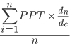 ;
;
where n is the number of neighborhoods in city c; dn is the density of each neighborhood, n; and dc is the density of city, c.
Comparing neighborhoods of different sizes: Due to variation in neighborhood sizes (see Figure 1), it is impossible to directly compare neighborhoods across cities. We compensate for this challenge by comparing PPT and PTC within the same city to reveal the effect of neighborhood population density on the overall performance of the Sustainable Public Transportation indicators. Since the indicators have different units – PTC is a percentage and PPT is in meters – we did not aggregate them into a composite indicator. In other words, this approach encourages comparison of the two indicators to understand how transit performance varies across different cities and different indicators to understand how transit performance varies within the same city (see the Discussion section for more on the topic of comparing cities). Since population data were not available for all pilot cities at a level more granular than the neighborhood scale (e.g. by block or census tract), a similar weighting approach could not be used to calculate neighborhood-level indicators. Thus, both the neighborhood- and city-level of each indicator are based on the assumption that a neighborhood’s population is evenly distributed throughout its area, except for known areas of green space.
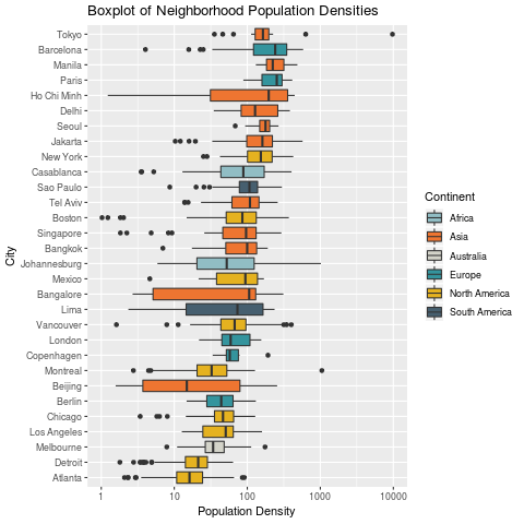
Figure 1. A box plot that illustrates the wide variation in the land area and population of neighborhoods in each of the pilot cities, because they are defined politically, rather than scientifically for comparison.
Accounting for public health and environmental justice: While the Sustainable Public Transportation category estimates the proximity to public transportation in urban neighborhoods, it reflects only one dimension of transportation’s role in cities’ social and economic systems. Beyond the environmental benefits, public transit also provides a more active mode of transportation compared to personal vehicles; these positive health outcomes are not captured in the Sustainable Public Transportation indicator. Traveling by public transportation encourages an active lifestyle, typically requiring commuters to walk farther by extending the pedestrian legs of the journey. Besser & Dannenberg16Besser, L.M. & Dannenberg, A.L. (2005). “Walking to Public Transit: Steps to Help Meet Physical Activity Recommendations,” American Journal of Preventive Medicine 29 (4): 273–80, https://doi.org/10.1016/j.amepre.2005.06.010. (2005) analyzed a US national survey to find that walking to and from a transit stop satisfied the daily recommended minimum 30 minutes of physical activity for nearly 30 percent of their survey respondents who use transit. The authors also found that this effect was greater in high density urban areas, as well as among minorities and people below the poverty line. Other studies have also shown that increased public transit ridership may reduce obesity rates.17She, Z., King, D. M., & Jacobson, S. H. (2017). Analyzing the impact of public transit usage on obesity. Preventive medicine, 99, 264-268.
Accounting for variation in quality of service: The Sustainable Public Transportation indicator does not capture the levels of service, such as the frequency of buses or trains passing by a stop, reliability of service, connectivity of stops, or the commute times of transit riders in different locations. The quality of public transportation service impacts riders’ willingness to walk to access that stop. The walking distance buffers of 420 meters for bus stops and 1.2 kilometers for train stops do not capture this variation in willingness to walk. There are many factors that may also impact the ridership of public transport systems, including cost, information dissemination, cultural norms, climate and weather, and spatial access. 18Daniels, R. & Mulley, C. (2013). Explaining walking distance to public transport: The dominance of public transport supply. The Journal of Transport and Land Use, 5 (2): 5-20.This indicator focuses on spatial access, a key element of equitable access to public transportation.
For a discussion of alternative methods we explored to calculate Sustainable Public Transit, see Box 2, Alternative Method: Disaggregating Population and Box 3, Alternative Method: Transit Accessibility (Applied to Singapore).
Transportation in the Sustainable Development Goals
Transportation is a cross-cutting issue that relates to seven19According to the UN Sustainable Development website, “There are a number of SDG targets directly linked to transport, including SDG 3 on health (increased road safety), SDG 7 on energy, SDG 8 on decent work and economic growth, SDG 9 on resilient infrastructure, SDG 11 on sustainable cities (access to transport and expanded public transport), SDG 12 on sustainable consumption and production (ending fossil fuel subsidies) and SDG 14 on oceans, seas and marine resources.” (Sustainable Development Knowledge Platform. Global Sustainable Transport Conference. Retrieved from: https://sustainabledevelopment.un.org/index. php?page=view&type=20000&nr=802&menu=2993). Sustainable Development Goals (SDGs), each suggesting transportation-relevant indicators. SDG 11 Target 11.2 calls for sustainable urban development for all, particularly for “vulnerable situations, women, children, persons with disabilities and older persons” (see Box 4, Why Isn’t Public Transit Gender Neutral?, for a discussion of barriers to public transit access according to gender). The single indicator for target 11.2, SDG Indicator 11.2.1, refers to the “proportion of population that has convenient access to public transport, by sex, age and persons with disabilities.”20United Nations. Sustainable Development Knowledge Platform. Retrieved from: https://sustainabledevelopment. un.org/sdg11 (accessed 9 August 2018).
As mentioned above, transportation is one of the largest contributors to urban greenhouse gas emissions (GHGs) globally (see Box 5, Transportation and the New Economy). Increasing the share of trips taken by public transportation, instead of through individual automobile travel, can lower GHG emissions per passenger mile. For example, the average single occupancy vehicle in the United States emits 0.964 pounds of carbon dioxide per passenger mile, whereas light rail and buses emit 0.365 and 0.643 pounds, respectively. 21Calculated from Federal Transit administration 2008 National Transit Database (NTD).To address transportation’s large share of urban emissions, dense mixed-use developments surrounding public transit are a goal for urban planning and development. SDG 12 also suggests ending fossil fuel subsidies used to lower the price of gasoline and other fossil fuels in some countries, which would greatly increase the price of car travel and likely lead to changes in urban development patterns. Seto et al. (2011) showed that fuel prices are a strong indicator of the rate of urban expansion globally, hinting at the systemic nature of the relationship between transportation and urbanization. Other SDGs (SDG 7 on sustainable energy generation and provision, SDG 8 on decent work opportunities and economic growth, SDG 9 on resilient infrastructure) rely on changes in transportation infrastructure and patterns of use, though the transportation sector is not specifically mentioned in the targets or indicators.
Box 2. Data Availability and Limitation of Transportation Indicators
While our data analysis provides valuable insights into UESI cities’ public transportation coverage, there are several limitations that should be considered when interpreting our results, especially for cities in China.
One potential limitation of our study is the use of transportation data from OpenStreetMap (OSM), an open-source database that relies on citizens to contribute data. While OSM is a valuable resource, it’s possible that the data available on OSM may be outdated or incomplete, which could impact the accuracy of our findings. This issue is primarily relevant for Chinese cities, but also for other cities like Evansville, IL and Paterson, NJ in the US for which there is no public transportation data available in OSM.
")
Figure 2. Available OSM transportation data of Dalian, China (Acquisition date: January 2023)
Another limitation of our study is related to the unit of analysis (neighborhood) for each city used to calculate transportation coverage and distance to transit stops. As discussed in the Methods section, there is great variability in how cities define neighborhood boundaries. In Chinese cities, neighborhoods have very large land areas and are not necessarily entirely “urban” in the sense that we define them (see Box 2 in Methods). In conjunction with the data limitations of OSM, this challenge could lead to an underestimation of transportation coverage and an overestimation of the distance to a transit stop for Chinese cities compared to cities in other countries and regions where neighborhoods are smaller and OSM has more information, impacting the UESI scores for the former cities. As a result, many Chinese cities like Dalian pictured in Figure 2 have low scores on the UESI’s transportation indicators with 26 on the distance to transit stops and 52 on transportation coverage.

Figure 2.2. Distribution of neighborhood size for UESI cities (km2) by country. (*Note: only plot the countries with five or more cities.)
By acknowledging these limitations and discussing their potential impact on our findings, we aim to provide a clear and transparent understanding of our results. Due to these limitations, when calculating the aggregated UESI weighted score for all cities, we downweight the transportation indicators compared to other indicator categories to take into consideration the fact that some cities like those in China might be unfairly penalized based on the way they define their neighborhood boundaries. In fact, Chinese cities are in many ways leading the world in public transportation and infrastructure investments, with 45 subway lines in existence as of the end of 2022 and 70% of their railway electrified. Moving forward, future research could explore alternative data sources to further enhance our understanding of transportation in Chinese cities.
Box 3. An alternative dataset for measuring public transit
Given that the population data collected for use throughout the UESI are disaggregated only to the neighborhood level, we explored an alternative method of capturing the variation of population density within neighborhoods. While the indicator used in the chapter relies on neighborhood census data, the alternate method utilizes a gridded data set based on census population estimates gathered from around the world, which is calculated by Center for International Earth Sciences Information Network (CIESIN, 2017). The UESI indicators rely on self-reported government census data for neighborhood population, which consists of a single population value for each neighborhood. Using the neighborhood level census data to measure access to transit stops assumes that the population is evenly spread within the neighborhood, which is often not the case (See, among others, Robert Cervero, 2007; Seto et al., 2014). 22Cervero, R. (2007). Transit-oriented development’s ridership bonus: a product of self-selection and public policies. Environment and planning A, 39(9), 2068-2085.23Seto K.C., S. Dhakal, A. Bigio, H. Blanco, G.C. Delgado, D. Dewar, L. Huang, A. Inaba, A. Kansal, S. Lwasa, J.E. McMahon, D.B. Müller, J. Murakami, H. Nagendra, and A. Ramaswami, 2014: Human Settlements, Infrastructure and Spatial Planning. In: Climate Change 2014: Mitigation of Climate Change. Contribution of Working Group III to the Fifth Assessment Report of the Intergovernmental Panel on Climate Change [Edenhofer, O., R. Pichs-Madruga, Y. Sokona, E. Farahani, S. Kadner, K. Seyboth, A. Adler, I. Baum, S. Brunner, P. Eickemeier, B. Kriemann, J. Savolainen, S. Schlömer, C. von Stechow, T. Zwickel and J.C. Minx (eds.)]. Cambridge University Press, Cambridge, United Kingdom and New York, NY, USA. As described elsewhere, using the average population could penalize planning that provides higher levels of public transportation service to more dense neighborhoods; thus, the indicator should ideally account for variation in population density within a neighborhood.
Many of the cities included in the UESI do not make disaggregated census data publicly available, however, which poses a particular challenge for this indicator because it is highly spatial in nature. One alternative we explored for this indicator is to draw on globally available data from the Global Rural-Urban Mapping Project (GRUMP) version 4, published by the NASA Socioeconomic Data and Applications Center and hosted by the CIESIN at Columbia University. The resolution of the GRUMP dataset, however, is larger than some smaller neighborhoods in the selected cities (see Figure 2 below, and recall Figure 1 displaying the wide range of neighborhood sizes). Because of the variation in neighborhood size, this method results in non-trivial software errors when calculating the indicator based on GRUMP population data. The highlighted polygon is a small neighborhood in Bangalore that illustrates the possibility for error when a neighborhood only partially intersects a few cells from the GRUMP data set, each with a widely different population estimate. Absent a more disaggregated dataset, the UESI indicator is designed to estimate the number of people in the analysis area (city or neighborhood) that live within the transit walkshed based on the ratio of the area within the walkshed and the total area.
This example highlights the need in future iterations to develop a more standardized method of identifying comparable urban units of analysis.

Figure 3. The GRUMP data set for population in Bangalore with the neighborhoods overlaid show that these spatially-derived population density estimates may be too coarse in resolution at the neighborhood scale. While the GRUMP data shows promise for future iterations, it is not viable to estimate the population density within the transit walksheds. (Source: CIESIN, 2017.)
Box 4. Measuring transit accessibility in Singapore
The accessibility of urban amenities (e.g., shops, restaurants, schools, and workplaces) and public transportation is often identified as an important step toward improving sustainable urban transportation. At the neighborhood scale, mixed use development patterns place more urban amenities and sites of employment within walking distance to residential land uses and public transportation stops, potentially reducing demand for long distance travel. Transit-oriented design (commonly referred to as TOD) can encourage the use of public transportation or non-motorized travel over personal motorized vehicles. Transit accessibility can therefore lead to decreased demand for energy-intensive modes of transportation, meaning that in addition to being an effective planning instrument, the degree to which a city’s transit is accessible to amenities can be an indicator of urban sustainability. This measure of access to urban amenities is not currently used in the UESI, but is an important aspect to consider when evaluating urban transit. The method and case study below offer insight into a possible approach for quantifying a city’s transit accessibility.
Operationalizing Transit Accessibility
In accordance with the above description, transit accessibility should be (1) positively proportional to a neighborhood’s population density, (2) characterized by mixed use development, and (3) sensitive to the number of amenities within the neighborhood. Finally, (4) amenities farther from the station should contribute less to that station’s score. Based on these criteria, a transit station’s accessibility score can be quantified with the following equation:
![]()
where D is the population density of the neighborhood in which the station is located;
A is is the total number of amenities within the 500m buffer; and
da is the distance between an amenity and the station.
Accessibility, however, is also a property of cities as a whole. Cities should score higher on the index if their transit system is more accessible. Thus a city’s score can be calculated with the following equation:
![]()
where N is the number of metro stations in the city;
Cn is the accessibility score for station n; and
Dn is the distance between station n and the central business district, which accounts for the centrality of the station.24To account for polycentricity, this index could be modified to consider the distance between a neighborhood and the highest scoring neighborhood within some radius.
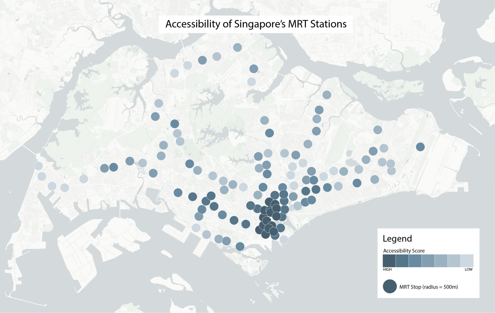
Figure 4. Transit accessibility score results across Singapore for neighborhoods surrounding MRT stops (darker colors correspond to higher scores).
The highest scoring nodes in Singapore are generally clustered around Marina Bay, part of the city center located near the island’s southeastern coast. The highly scoring nodes located on the west of the island are part of the Jurong East planning area, which Singapore’s Urban Redevelopment Authority identified as a future center of urban growth set to eventually become the city’s “second Central Business District.” 25The Straits Times. (17 December 2017). “The story of Jurong Lake District: From the boondocks to boom town – and beyond.” Retrieved from: http://www.straitstimes.com/singapore/from-the-boondocks-to-boom-town-and-beyond. Though the plans for this area are quite long term, some development has already occurred, as reflected in the neighborhood scores. This method of calculating transit accessibility, then, reflects some important characteristics of Singapore’s urban development.
Results for Pilot Cities
Sustainable Public Transit in the UESI
Public Transit Coverage in the UESI pilot cities ranges from near universal coverage 26It is important to note that the base shapefiles used to calculate indicators in this analysis represent only the central city and not an entire urban agglomeration area or an urban-rural transect. These values would decrease with a larger study area; however, as mentioned elsewhere, the decision to select the central city in the greater region was intended to make the findings directly relevant to policy makers and to limit the scope. in neighborhoods of Paris, Barcelona and Boston to about 30 percent in Detroit, Beijing, New Delhi and Manila. The top ten cities in the sample (top half) provide transit to well over half of their residents, while the bottom ten cities (bottom half) provide transit to between 46 percent (Montreal) and 27 percent (Detroit and Beijing). A relatively large gap separates the 17th and 18th ranking cities (Singapore at 77 percent and Ho Chi Minh City at 56 percent, respectively) making two natural clusters of higher and lower ranking cities. The top five cities are situated in developed countries, some of which are well-known for their transit systems. Part of the gap between developed and developing countries (Table 2) may be due to poor data coverage or a reliance on informal bus and taxi services in developing countries.
On the Public Transportation Coverage indicator, the difference between the average city-level access and the average neighborhood-level access suggests that transit stops are located in more densely populated neighborhoods for the UESI pilot cities. Figure 5 below shows the distribution of all neighborhood and city mean distances. Just under half of the population represented in the sample is not within proximity to public transit. Neighborhoods in the UESI cities have populations ranging from a minimum of 10 in Singapore to a maximum of nearly 3.95 million in Beijing. The median population for all neighborhoods is 95,370. In sum, the population of the UESI pilot cities together represent more than 147.1 million people.
Table 2. UESI pilot cities’ distance to public transit, both weighted and unweighted by population density. Cells highlighted in green represent cities where the average distance to a transit stop is 420 meters or less (the distance the average resident is willing to walk to a bus stop), while cells highlighted in yellow represent cities where the average distance to a transit stop is greater than 1.2 kilometers (the distance the average resident is willing to walk to a metro stop).
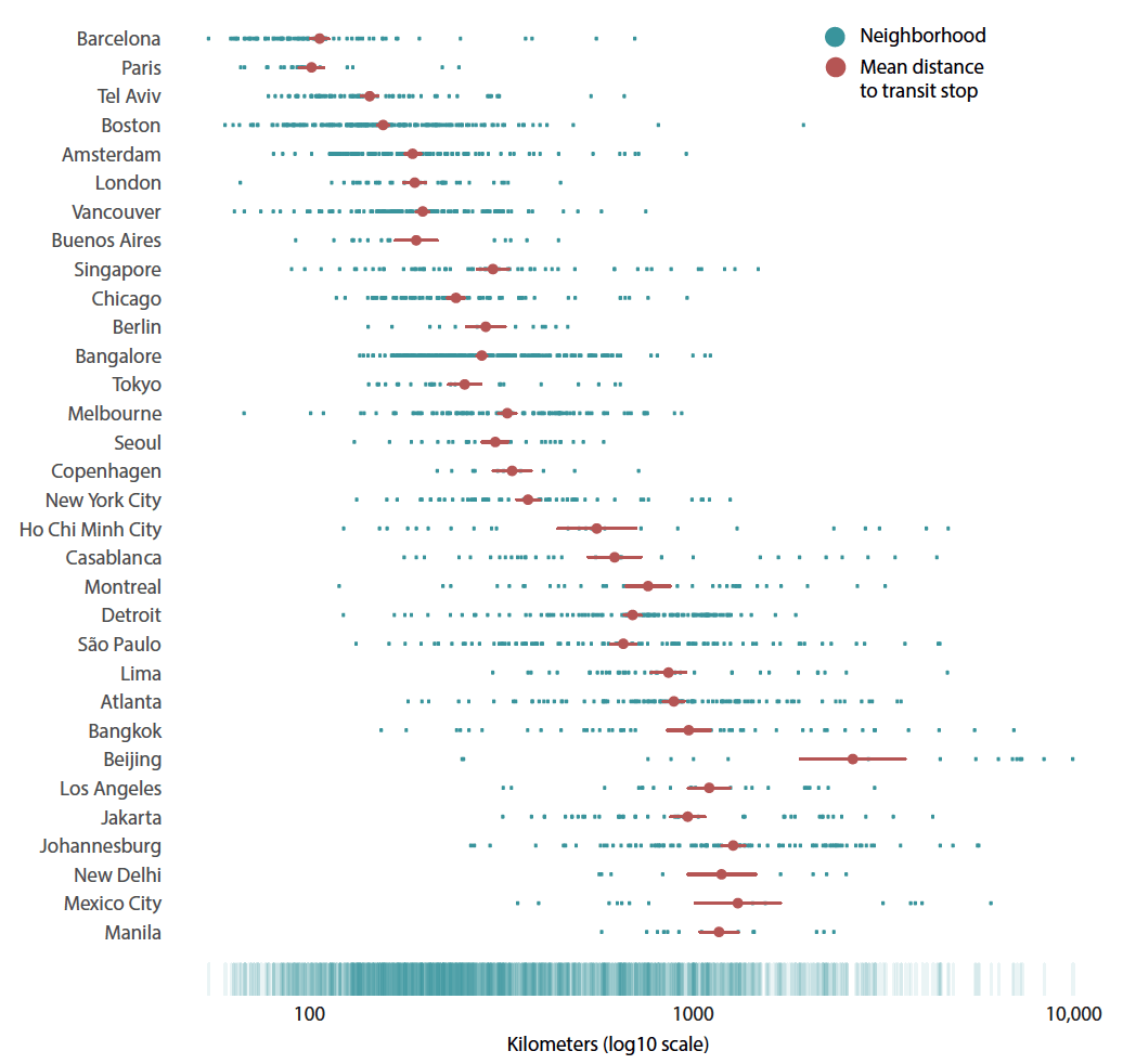
Figure 5. Mean distance to transit stops among the UESI pilot cities. Each blue dot represents one neighborhood, and the position along the x-axis shows the mean distance to a public transit stop in that neighborhood. The red dot represents the simple mean distance to a transit stop throughout the entire city, and the orange lines show the standard deviation. The cities are ordered by the mean distance to a transit stop, weighted by the population density. The “rug” along the bottom of the figure shows the range where most of the neighborhoods lie.
Box 5. Why Isn’t Transport Gender Neutral?
Our analysis of public transit access equity assumes urban dwellers will take advantage of public transportation within walksheds. In reality, this scenario is seldom the case; many factors, such as safety on public transit, can lower transit use. In particular, women face more barriers to public transport access. This problem has huge social development and civil rights implications as limited access to public transport restricts women from jobs and learning opportunities, and prevents them from actively participating in social activities.
Sexual Harassment and Access to Public Transport
Both women and men experience sexual harassment on public transport, though harassment survivors are primarily women. Sexual harassment can take a variety of different forms, that can range from verbal and physical contact. 27D’Silva, E. (2018, January). Why Transport is not Gender Neutral. Presented at the 2018 Transforming Transportation Conference, Washington, D.C.The FIA Foundation and CAF Latin American Development Bank report “Ella Se Mueve Segura- She Moves Safely,” examines women’s security on public transport in three Latin American cities (see Figure 6). The report finds that 72 percent of Buenos Aires female respondents and 58 percent of male respondents feel insecure on public transport due to harassment.28FIA Foundation, & CAF Latin American Development Bank. (2017). Ella Se Mueve Segura- She Moves Safel (FIA Foundation Research Series No. Paper 10). Retrieved from: https://www.fiafoundation.org/media/461162/ ella–se–mueve–segura-she-moves-safely.pdf.
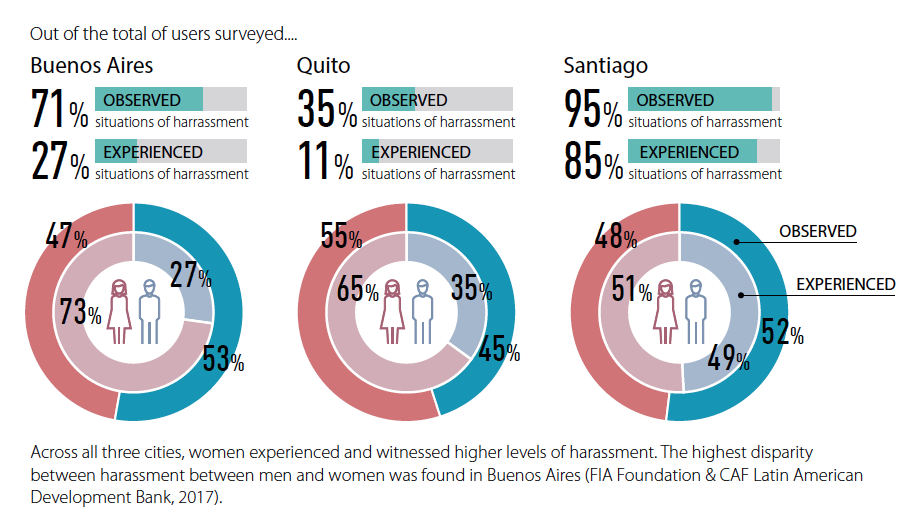
Figure 6. Summaries of experienced and observed harassment in Buenos Aires, Quito, and Santiago, as reported by men (in blue) and women (in red). Across all three cities, women experienced and witnessed higher levels of harassment. The highest disparity between harassment between men and women was found in Buenos Aires (FIA Foundation & CAF Latin American Development Bank, 2017).
In China, a report on the state of public harassment in Shenzhen’s public transport shows 42 percent of women have experienced sexual harassment. The probability of experiencing harassment is 10 percent higher among students and young people. 29Zhang, W. (2017). Shenzhen Public Transport Harassment Report. Retrieved from: http://www.chinadevelopmentbrief.org.cn/news-20712.html.Their higher risk demonstrates that the phenomena of sexual harassment depends on a combination of different factors, including gender, age and class. These reported figures, however, may underestimate the true values, as most survivors choose to remain silent.30D’Silva, E. (2018, January). Why Transport is not Gender Neutral. Presented at the 2018 Transforming Transportation Conference, Washington, D.C.
The experience of sexual harassment can affect physical and mental health. The insecurity of public transport has caused women riders to abandon public transport, thereby restricting their job and learning opportunities, and preventing them from actively participating in social activities. Losing the ability to use public spaces as a result of sexual harassment is a civil rights violation, and sexual harassment represents a threat to social development.30
Professional Participation and Decision Making Power
Women are less represented in transportation occupations such as bus, train, or truck drivers and construction workers. This underrepresentation is partially linked to the gender stereotypes that exist in many cultures and to gender discrimination in hiring and working environments. In addition, the transportation sector has long been a male-dominated sector. There are fewer women employed compared to men, and women seldom serve as high-level decision-makers. Transportation policies have long neglected the needs of women, due to their absence from the planning and decision-making processes.31D’Silva, E. (2018, January). Why Transport is not Gender Neutral. Presented at the 2018 Transforming Transportation Conference, Washington, D.C.
Addressing Transport Gender Inequity with Data
Data collection can support a shift towards greater gender equity in public transit access and use. There is a huge data gap in addressing gender inequity in transportation. Without data, we cannot formulate transportation policies that take into account the needs of women. For starters, we do not know where and how women use public transportation. Research shows that in Buenos Aires, women’s travel needs are different from men’s, including traveling more frequently and for different purposes (such as picking up their children).32D’Silva, E. (2018, January). Why Transport is not Gender Neutral. Presented at the 2018 Transforming Transportation Conference, Washington, D.C. Cities should collect more gender-specific data to help develop more gender-inclusive transportation policies and create safer public spaces. Crowdsourcing is one option for gathering such data. The Safecity project (http://safecity.in) in India allows survivors to locate and share their stories through mobile phones. 33Safecity. (2018). Safecity-Pin the Creeps. Retrieved from: http://maps.safecity.in.This valuable data can not only increase public awareness of sexual harassment, but also advance the formulation and legislation of anti-sexual harassment policies.
Figure 7. An interactive map from the Safecity project shows harassment reports in India. Survivors can use the map to locate instances of harassment and share their stories via mobile phone (Safecity, 2018).
Key Equity Considerations
Using the approach described in the Equity and Social Inclusion Indicator Profile, we analyzed the distributional equity of income and distance to public transit. The results show that the majority of the pilot cities have low income inequality (i.e. low Gini values), except for Johannesburg (see Figure 8). In Bangkok Beijing, Jakarta, São Paulo, Tokyo and to a lesser extent Manila and London, the burden of lack of proximity to public transit is falling more heavily on lower income populations. The inequities are most severe in Beijing, Bangkok and São Paulo, as determined in their position in the upper left-hand quadrant of the equity typology plot (Figure 9). Some cities, however, have managed to achieve near perfect equality with respect to distance to public transit – Barcelona for instance, has an Environmental Concentration Index (ECI) value of nearly 0, although it does have less equitable income distribution than other cities, such as Boston. Several cities are located in the upper right-hand quadrant (low Gini, positive ECI), which suggests that cities like Los Angeles, Montreal and New York City are burdening wealthier populations with greater distances to public transit. This result may also reflect a preference for wealthier populations living in these cities for choosing to live farther away from public transit stops.34The Economist. (2018). Public Transport is in decline in many wealthy cities. Retrieved from: https://www. economist.com/international/2018/06/21/publictransport- is-in-decline-in-many-wealthy-cities.
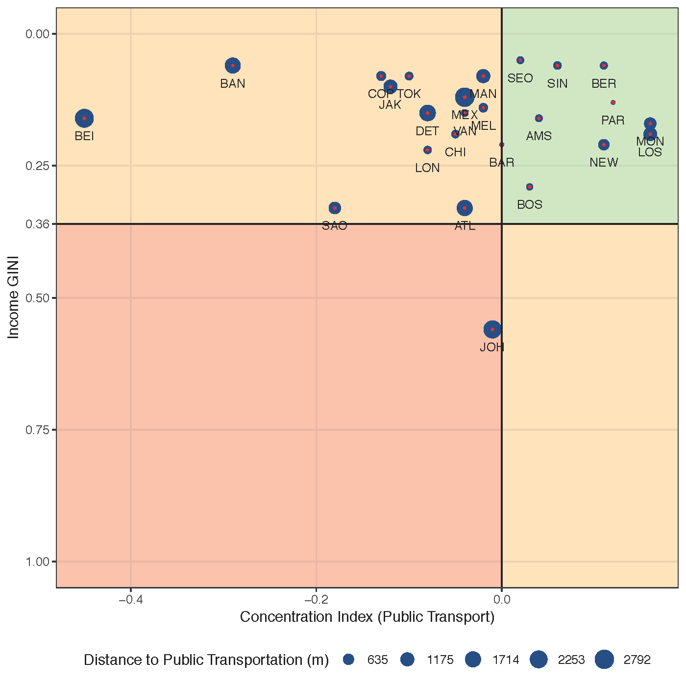
Figure 9. Distance to Public Transit Equity typology quadrant plot. The plot considers the Income Gini and Distance to Transit Concentration Index to define four quadrants. The Income Gini Values represent the distribution of wealth across the population and range in value from 0 to 1. A Gini value of zero indicates a perfectly equal distribution of income across the population, while a high Gini value (out of a maximum of 1) suggests a highly unequal distribution of wealth. The Environmental Concentration Index (ECI) measures the variation of Distance to Public Transit in response to income. Negative ECI values indicate that the environmental burden is allocated on the poorest citizens, while a positive ECI indicates that the environmental burden is allocated on the wealthier citizens. The size of the dots represents the extent of a city’s distance to public transit (in m). (See the Equity and Social Inclusion Profile for a more detailed description of this plot).
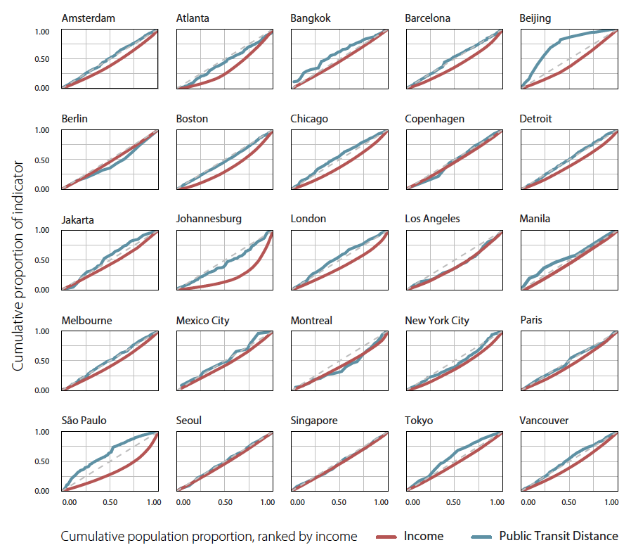
Figure 8. Environmental and income distribution curves for selected UESI cities. These plots show the concentration distributions of distance to public transit (e.g., the concentration curve in blue) and income (e.g., the Lorenz curve in red) throughout neighborhoods in cities. Deviations from the dotted line (e.g., the line of perfect equity) illustrate cities that are less equitable in their distribution of distance to public transit. Concentration curves above the line of equity indicate the environmental burden is more heavily allocated to those with less income; concentration curves below the line of equity indicate that the environmental burden is more heavily allocated to those with greater income (see the Equity and Social Inclusion Indicator Profile for a more detailed description of this plot, and the Cities Page for a full exploration all cities’ environmental and income distribution curves).
The equity curves shown in Figure 8 provide further insights into the distribution of Proximity to Public Transit and Income in the UESI pilot cities. Cities exhibiting nearly equitable distributions of the distance to public transit can be identified as those with a blue line that follows the dotted diagonal line (the line of perfect equity). These include: Amsterdam, Boston, Seoul, Barcelona, Melbourne, and Johannesburg. The transportation curves of the following cities suggest that the environmental burden is allocated more heavily to lower-income earners: Bangkok, Beijing, Jakarta, London, São Paulo, Tokyo, and Vancouver. The transportation curves for Berlin, Los Angeles, Montreal, New York, and Paris suggest the opposite; i.e., that the burden of greater distance to public transit is more heavily allocated to higher-income earners. It is important to note that these curves do not indicate whether the Distance to Public Transportation for a given city is large or small. They simply indicate whether the Distance to Public Transportation remains relatively constant across the population.
It is noteworthy that the transportation curves for several cities cross the diagonal line of perfect equity, such as in the case of Barcelona, Copenhagen, Jakarta, and Mexico City. This result may suggest that certain segments of the population are taking on a disproportionate burden as compared to the rest of the population. For example, Jakarta‘s equity curve suggests that the middle-income earners, as illustrated by the slight bulge in the curve above the line of perfect equity between the 25th and 75th income percentiles bear a disproportionate amount of the environmental burden associated with distance to public transportation stops.
Discussion
Access to public transit is a critical measure of urban environmental sustainability, although it is a challenging indicator to assess consistently across cities. The UESI’s two sustainable public transit indicators, Proximity to Public Transport and Public Transportation Coverage, provide a first step for comparing how cities perform. When interpreting these indicators, however, it is important to note that they likely overestimate the real distance of a neighborhood to transit stops, since we expect population density to be higher closer to transit stops but have no way to account for this variability in the indicators. As well, the relationship between population density and the viability of public transit, while commonly used, varies between rapidly urbanizing and developed cities, and it is not clear whether transit stops are a leading or lagging indicator for population density.35Cooke, S., & Behrens, R. (2017). Correlation or cause? The limitations of population density as an indicator for public transport viability in the context of a rapidly growing developing city. Transportation Research Procedia, 25, 3003-3016. Despite these limitations, the spatial access explored by the Sustainable Public Transit indicators remains a crucial element of equitable access to public transportation in the UESI cities.
As previously mentioned, a key assumption underpinning the Sustainable Public Transit indicators is urban residents’ use of these options. Simple proximity to public transit does not translate into use. Contributing to public transit’s use is the quality of service – an indicator that we currently do not evaluate in the UESI but could be incorporated into future iterations. Service levels are often not homogeneous across different populations; for example, middle and low-income residents who live in more affordable suburban and peri-urban areas often have lengthy commutes, regardless of the distance to the nearest transit stop. The desirability of access to public transportation inflates the monetary value of residential units within transit walksheds, raising prices and leading to gentrification.
The UESI’s public transit indicators also may not adequately reflect the story of city-specific transit trends, such as the popularity of bike commuting in Amsterdam or the prevalence of informal bus systems in New Delhi, which provides an opportunity for future research and case studies. Lastly, the above-mentioned aspects of travel (e.g., safety, pollution levels, commuting time) are not included in the indicator of access, though they are important for quality of life and sustainability issues in urban areas and may be prioritized in future iterations of the UESI.
Future work could further explore intersections between transit and pollution. Higher density areas may have higher levels of air pollution due to traffic congestion – leading to a negative externality associated with a possible urban sustainability solution. This aspect may complicate the basic premise that walking to public transportation is a net health benefit. While effective public transit should reduce congestion and improve the capacity and efficiency of the overall transit system, cars and trucks do commonly use the same areas as pedestrians accessing public transit.
Box 6. Transportation and the new economy
Sustainable transport is a key component of UN SDG Goal 11. Car-, ride-, and bike-sharing technologies and services have also taken off in the past few years. As part of the larger “sharing economy” trend, these services are often marketed as “sustainable transport” options. What are the environmental implications of ride-sharing and bike-sharing services, and can they help deliver the sustainable transport objective?
Some research suggests that car-sharing services help reduce GHG emissions. Chen & Kockelman (2016) conducted a life-cycle inventory impact of car-sharing in the US and concluded that the average individual transportation energy use and GHG emissions decrease among car-sharing members by approximately 51 percent, which sums up to a 5 percent total reduction of household transport-related energy use and GHG emissions in the U.S.36Chen, T. D., & Kockelman, K. M. (2016). Carsharing’s life-cycle impacts on energy use and greenhouse gas emissions. Transportation Research Part D: Transport and Environment, 47, 276–284. https://doi.org/10.1016/j.trd.2016.05.012 Martin & Shaheen et al.’s (2016) research on Car2Go, a car-sharing service, in five North American cities also shows promising environmental results. 37Martin, E., & Shaheen, S. (2016). Impacts of car2go on Vehicle Ownership, Modal Shift, Vehicle Miles Traveled, and Greenhouse Gas Emissions: An Analysis of Five North American Cities. Transportation Sustainability Research Center, University of California Berkeley. Retrieved from: http://innovativemobility.org/?project=impacts-of-car2go-on-vehicle-ownership-modal-shift-vehicle-miles-traveled-and-greenhouse-gas-emissions-an-analysis-of-five-north-american-citiesThe authors found that joining Car2Go lowered households’ GHG emissions by 4 to 18 percent. City-wide, Car2Go services contribute to a reduction in GHG emissions ranging from “between 5,300 to 10,000 metric tons per year across the five cities, or 10 to 14 metric tons per year per car2go vehicle (on average) across the five cities.” Nijland & van Meerkerk’s (2017) survey of 363 car-sharing participants in the Netherlands found that their car ownership levels dropped 30 percent, and the mileage they drove dropped 15 to 20 percent, after joining the car-sharing program.38Nijland, H., & van Meerkerk, J. (2017). Mobility and environmental impacts of car sharing in the Netherlands. Environmental Innovation and Societal Transitions, 23, 84-91. Interestingly, however, a more recent study in Denver, Colorado by Henao & Marshall (2018) found that ride-sharing does not help reduce driving. The authors personally drove for ride-sharing companies to collect data, and estimated an increase in vehicle miles travelled by 83.5% due to the presence of ride-sharing.39Henao, A., & Marshall, W. E. (2018). The impact of ride-hailing on vehicle miles traveled. Transportation. https://doi.org/10.1007/s11116-018-9923-2
Evidence about the effects of bike sharing on the environment is also unclear. While Fuller et al. (2013) found that Montreal’s public bike-sharing program led to greater likelihood of cycling in areas where the services are available, 40Fuller, D., Gauvin, L., Kestens, Y., Daniel, M., Fournier, M., Morency, P., & Drouin, L. (2013). Impact evaluation of a public bicycle share program on cycling: a case example of BIXI in Montreal, Quebec. American Journal of Public Health, 103(3), e85-92. https://doi.org/10.2105/AJPH.2012.300917more people riding bikes does not guarantee lower emissions. A survey of bike-sharing programs in five cities across the United States, the United Kingdoms and Australia revealed that, while bike sharing helped reduce motor vehicle use in Melbourne, Minneapolis/St. Paul and Washington, D.C., it was correlated with an increase in motor vehicle use in London. 41Fishman, E., Washington, S. & Haworth, N. (August 2014). “Bike Share’s Impact on Car Use: Evidence from the United States, Great Britain, and Australia.” Transportation Research Part D: Transport and Environment, 31:13–20. https://doi.org/10.1016/j.trd.2014.05.013.The discrepancy can be explained by differences in car mode substitution rate (i.e., how effectively bikes can replace cars) as well as the additional motor vehicles required to redistribute bicycles in the bike-sharing programs.
The availability of navigation and web mapping technologies provides transportation planners and city dwellers new options for providing and accessing transport systems. These technologies also enable replicable analysis of transit data that can, if integrated into decision-making, help cities improve their own transportation service. The standardized General Transit Feed Specification (GTFS)42See the documentation on Google’s help page: https://developers.google.com/transit/gtfs/ format for transit data enables integration between GoogleMaps data and transit agencies’ mapping systems for real-time and planning uses. OpenStreetMap (which also integrates GTFS) contains static information about the locations of transit stops. Both technologies interface with routing software to enable real time information about transit service.
These innovations promise to decentralize the way transit providers operate and the way researchers gather data. Ride-sharing companies — such as Uber, Lyft, and Ola — rely on mapping technologies to develop efficient on-demand transportation options. Assessments of vehicle utilization rates (i.e., the ratio of total distance to distance travelled with passengers) show that Uber is more efficient than traditional taxis.43Cramer, Judd, and Alan B. Krueger. (May 2016). “Disruptive Change in the Taxi Business: The Case of Uber.” American Economic Review, 106(5):177–82. https://doi.org/10.1257/aer.p20161002. 44Kim, Kibum, Chulwoo Baek, and Jeong-Dong Lee. (April 2018). “Creative Destruction of the Sharing Economy in Action: The Case of Uber.” Transportation Research Part A: Policy and Practice 110:118–27. https://doi.org/10.1016/j.tra.2018.01.014. While ride services may be more efficient and provide a useful option for some residents, their integration into transportation planning has not been without challenges. Political battles and protests have arisen concerning permitting for these services, and news stories have flooded the airwaves lamenting the economic hardship of both Uber drivers, 45BusinessPundit: NYC uber drivers to protest latest rate cuts (2016). Chatham: Newstex. Retrieved from: https://search-proquest-com.proxy.library.cornell.edu/docview/1761484750?accountid=10267. and lost revenue of traditional taxis facing competition from new services. 46“How Ola, Uber are making other taxi firms irrelevant.” (30 August 2015). Business Today. Retrieved August 7, 2018 from Infotrac Newsstand: http://link.galegroup.com.proxy.library.cornell.edu/apps/doc/A425353566/STND?u=nysl_sc_cornl&sid=STND&xid=29114132 . 47Trefis: French taxi drivers protest uber. (2016). Chatham: Newstex. Retrieved from: https://search-proquest-com.proxy.library.cornell.edu/docview/1761454837?accountid=10267.These services’ shifting, market-driven routes do not allow for easy mapping of access points, a common method in transportation planning, compared to public transportation stops and routes.
Figure 10. Uber drivers in Sao Paulo protest new Federal regulations that limit their activity throughout Brazil. (Andre Penner, 10/30/2017 5:27:58 PM. Sao Paulo, Brazil. Associate Press, 2017)48Andre Penner, 10/30/2017 5:27:58 PM, tstargardter, and AP. Brazil Ride Sharing Legislation. The Associated Press, 2017. http://search.ebscohost.com/login.aspx?direct=true&db=apg&AN=00792eb3a32046a79703ef986ca33cf0&site=ehost-live.
The Sustainable Public Transit indicators do not account for ride-sharing options, though future iterations of the UESI may account for this difference as it grows in importance.