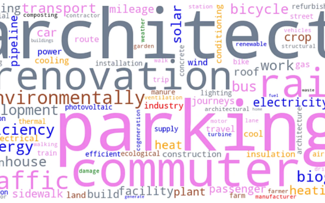
Analysis of climate policy documents from 318 cities shows that specific text patterns can predict ambitious plans and that deciding cities’ climate strategies involves trade-offs. Read the paper published in npj Urban Sustainability. This blog was...
Data-Driven EnviroLab’s Principal Investigator, Dr. Angel Hsu, has received a $503,819 grant from the National Science Foundation for a 3-year research project, “Catalyzing virtuous cycles of climate action: an empirical model of polycentric climate governance.” The...
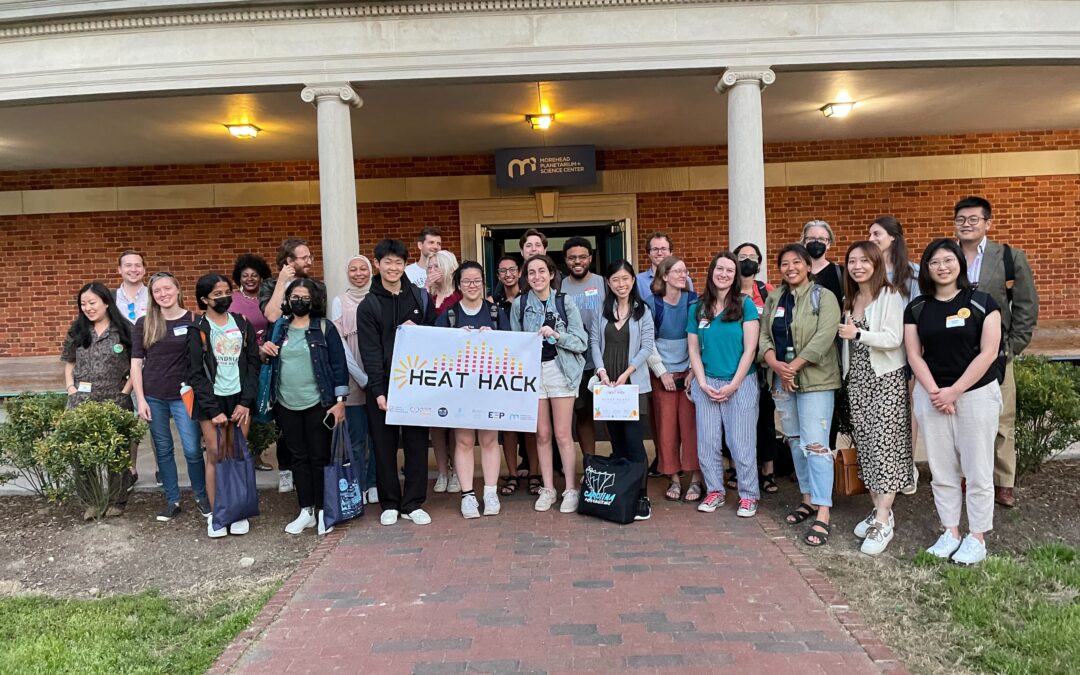
On April 23, nearly 40 community members came together to hack solutions to urban heat in the Research Triangle as part of Data-Driven EnviroLab’s Heat Hack 2022. In partnership with the NC Museum of Life and Science and as part of the NC Science Festival, we opened...
Data scientists are stepping up in the fight against coronavirus. They are offering powerful digital tools that can provide both the public and policymakers with better information, potentially tipping the scales against the invisible enemy. Of these tools, Geographic...
Data is everything, and everything is data. Understanding how to use and analyze it is the most critical skill of the 21st century, particularly for the environment, which comprises a multitude of complex systems and phenomena. To drive scientific inquiry and reach...


Recent Comments