#SmogStripes Reveal Which Cities are Making Progress on Clean Air
By Angel Hsu, Chester Ling, and Diego Manya
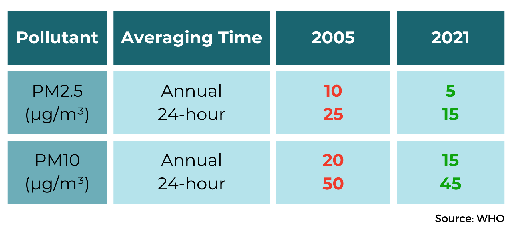
The World Health Organization (WHO) in 2022 indicated that effectively the entire global population – 99 percent – breathes air that exceeds safe pollution limits. This evaluation was based on a sample of over 6,000 cities in 117 countries that now regularly monitor air quality from ground-based stations. It is encouraging that so many cities – 2,000 and counting – are now reporting data for particulate matter pollution, both coarse (PM10) and fine (PM2.5), which has severe health consequences including cardiovascular disease and stroke. Regular monitoring of these harmful pollutants is essential for preventing cardiovascular mortality associated with both indoor and outdoor pollution, which is the primary cause of death attributable to air pollution. WHO cited far-reaching, concrete evidence of air pollution’s pernicious effects on human health as the major impetus to revise its air quality guidelines in 2021 – the first major update in 15 years (Figure 1). WHO hopes with these revised recommendations that governments will acknowledge air pollution’s dire implications for human health and act to save lives.

Figure 1. 2005 vs. 2021 air quality guidelines for particulate matter pollution (PM2.5 and PM10).
#SmogStripes
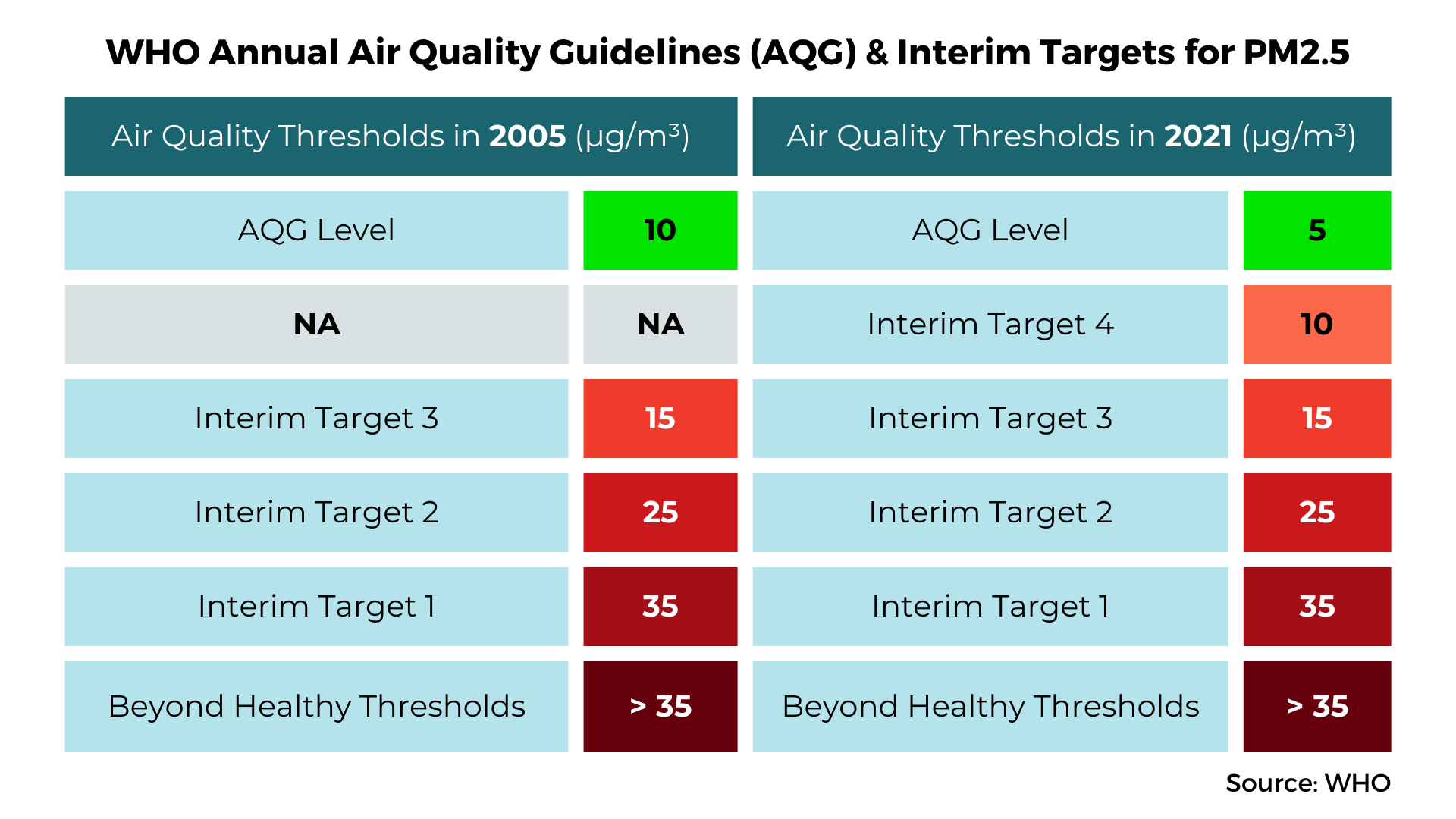
#SmogStripes evaluates cities’ performance using open-source data on local ambient air quality, measured by annual mean PM2.5 concentration. We use a color scheme inspired by the U.S. Air Quality Index (AQI), a benchmark used to communicate the severity of air pollution levels to the public through an easy to understand color scheme (Figure 2). Cities’ annual average PM2.5 concentration, measured by both satellite and ground-based monitors that feed a range of publicly-available data sources (e.g., State of Global Air, Air Quality Life Index, World Health Organisation, IQAir; and the Urban Environment and Social Inclusion Index), were plotted as #SmogStripes according to the corresponding thresholds in WHO’s index. Green indicates that air quality complies with all WHO targets, and shades of red indicate an exceedance of the recommended WHO level – the darkest shade of red indicates that all WHO guidelines have been exceeded.
We calculated the stripes according to both the 2005 and 2021 WHO annual thresholds to reflect upgrades in the guidelines and the differences in evaluating a city’s air quality when using both standards. For example, the recently established 2021 guidelines for “safe” PM2.5 concentrations stand at approximately 5 μg/m3, whereas the 2005 standards for safe PM2.5 concentrations were set at 10 μg/m3. Consequently, cities that had demonstrated commendable performance below 2005’s 10 μg/m3 benchmark might now be categorized as having unsafe air quality.

Figure 2. WHO Annual Air Quality Guidelines and Interim targets for fine particulate matter pollution (PM2.5) and the associated color gradings for #SmogStripes.
While some of these numbers are encouraging, particularly for those living in cities who have improved air quality, we must acknowledge that these advancements are relatively modest in light of the substantial reductions needed to align air quality with WHO’s recommended thresholds. To illustrate: assuming the average reduction in PM2.5 concentrations for improving cities (2.28 μg/m3 per decade), a city with residents exposed to 35 μg/m3 (the lowest WHO interim threshold for both 2005 and 2021) would need 131 years to reach safe levels of PM2.5 (around 5 μg/m3). This example makes clear the imperative for urgent and immediate actions to improve air quality.
#SmogStripes is a new tool that anyone can use to understand their city’s air pollution challenge and compare it with others. To access the full app, where you can select your own city, visit: https://datadrivenlab.us.reclaim.cloud/smogstripes/. Image: SmogStripes
Harnessing #SmogStripes for Action
Despite this pushback, there are recent examples of progress in unexpected places, like in Warsaw, Poland, a European city that has regularly failed to meet WHO pollution limits, ranking 14th worst out of 57 cities in Europe. Warsaw’s #SmogStripes show recent improvements in PM2.5 concentrations, showcasing early results from policies that reduce air pollution from major sources like coal-fired furnaces and passenger vehicles. In Dec. 2023, city councilors voted in favor of establishing Poland’s second low emission zone (LEZ) that would require vehicles to meet certain emission standards. To garner support for Warsaw’s LEZ, civil society groups worked with the local government to initiate a public awareness campaign and consultation that gathered feedback from 3,000 community members over several months.
The case of Warsaw’s LEZ and the political challenges it faced to achieve community and decisionmaker support illustrates the importance of public awareness. This buy-in is necessary for air pollution control policies for major pollution sources like vehicles because the solution requires the active involvement of those contributing to the problem.
“Thanks to the activities of non-governmental organizations, public awareness of the impact of air pollution on health has significantly increased in Warsaw. This has given local authorities a mandate to introduce solutions such as the LEZ. Data, if presented well, can be a huge support in this effort,” Magdalena Młochowska, Director Coordinator for Green Warsaw, City of Warsaw, told us.
We hope that #SmogStripes reproduces the success of the viral #ShowYourStripes movement started by Ed Hawkins’ visualization, which has sparked fashion trends and Summer Solstice events. We aim to catalyze meaningful dialogue between civil society, community members, planners, and politicians to foster a sense of urgency for air pollution action. Collective efforts are needed to expand the number of cities improving air quality and also to accelerate the pace of improvements.
Let’s drive awareness about the dangers of air pollution and strive for every city to get greener, cleaner, starting today.

Recent Comments