The World Economic Forum invited me to present at the Sustainable Development Impact Summit on September 23-24 in New York City, timed with Climate Week and the UN Climate Summit. I was asked to adapt a presentation I gave (“Big Picture on Urban Fragility“) at the 2019 WEF Annual Meeting of New Champions in July, which featured Carnegie Mellon’s Earthtime Platform and the Data-Driven Lab’s Urban Environment and Social Inclusion Index (UESI). We designed the UESI to be a practical tool for decision-makers to track progress towards Sustainable Development Goal 11 (SDG-11), which sets a charge for urban areas to be “sustainable and inclusive.” But what does it mean to ‘build a sustainable and inclusive city,’ and how is the world doing with SDG-11 and the rest of the 2030 Sustainable Development Agenda?
Here are a few key takeaways from my presentation, showcasing the amazing visualization capabilities of Earthtime:
- Increasing wealth often masks growing inequality within cities.
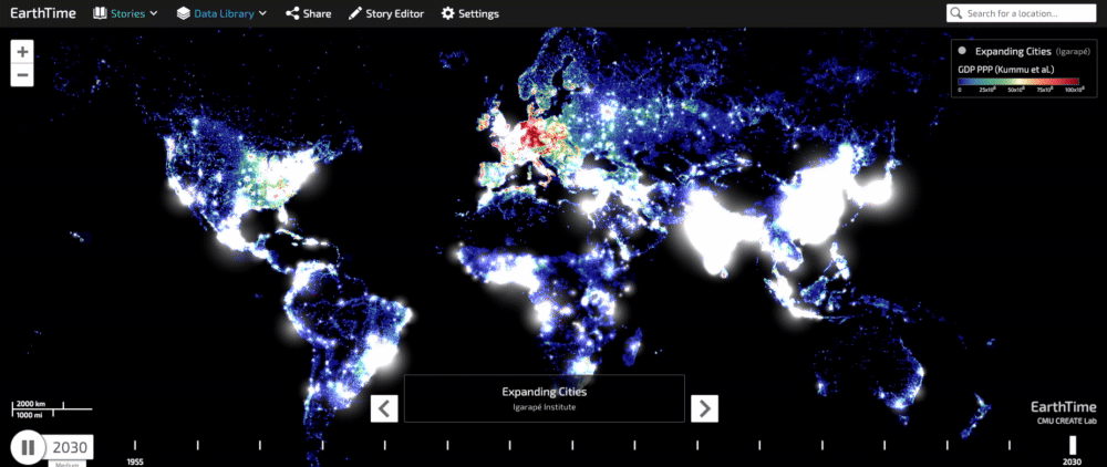
Already, just over half of the world’s population lives in cities – and this number is expected to grow to nearly 70 percent by 2050. Urban areas account for roughly 80 percent of global GDP. This map tracks Purchasing Power Parity, a metric of economic productivity and standards of living, from 1990 to 2015. The redder areas correspond to higher levels of economic development. In this map, we can see that areas where urbanization has been happening since 1950 often coincide with higher PPP. But if you look closely, the picture isn’t all uniform – cities don’t automatically equate with wealth and prosperity. Many of the world’s most rapidly urbanizing and developing places are located overwhelmingly in low-income and lower-middle-income countries – particularly in Asia and Africa – where municipal governments have the fewest per capita financial resources.
2. Cities are not sharing environmental benefits equally.
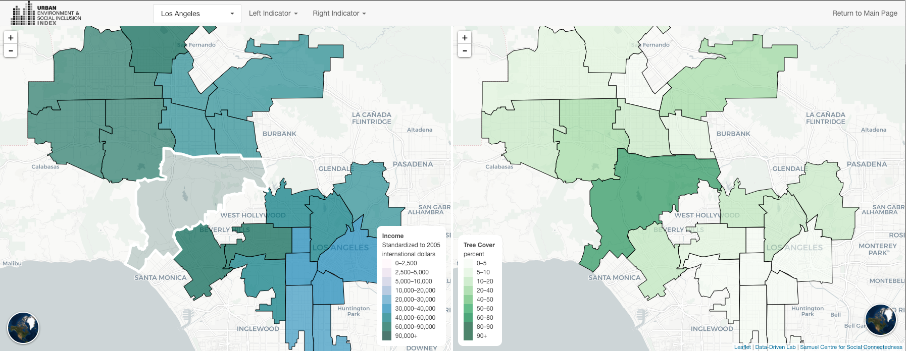
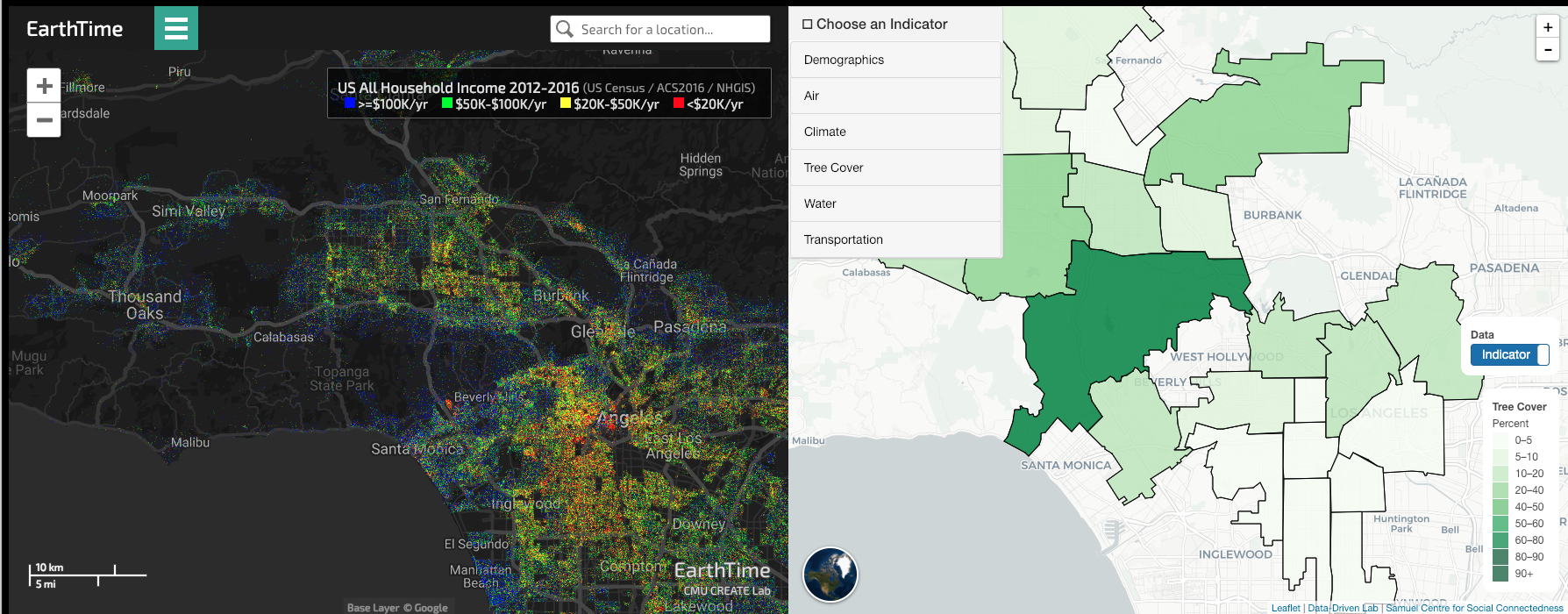
As this side-by-side comparison of Los Angeles’s median household income and tree coverage show, there are stark disparities in the levels of access urban neighbourhoods have to tree cover. Since green spaces often serve as public spaces, they can increase social and economic well-being, and have been shown to reduce crime and foster social cohesion. Tree cover and green space also help regulate air pollution and high temperatures. Trees filter out air pollution and provide shade and evaporative cooling. So not only do poorer neighborhoods lack access to tree cover, they’re also more vulnerable to air pollution and climate change. You can see these disparities closer in the dotmap visualization of US household income below:
3. Cities are disproportionately burdening poorer residents with environmental harms, like pollution and heat.
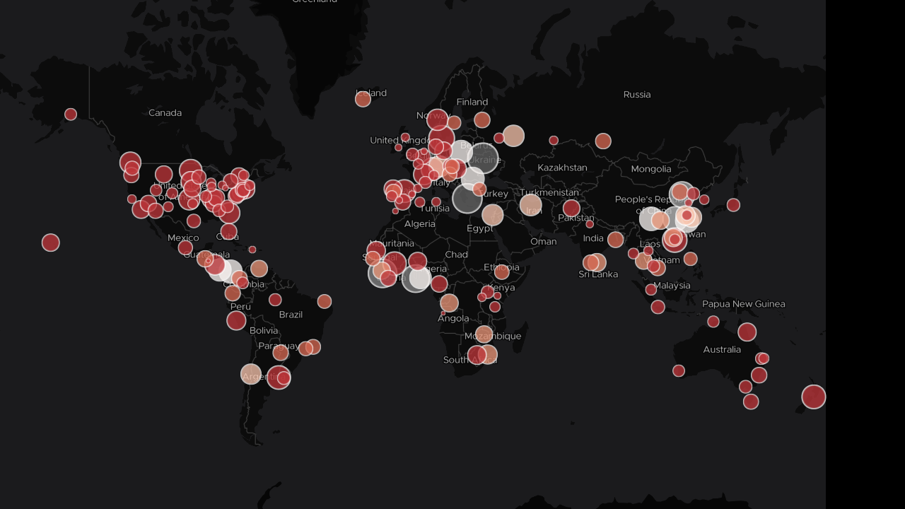
Using satellite data developed by one of our lab members, Yale PhD candidate TC Chakraborty, we can compare how the urban heat island effect is distributed within cities. The size and color of the dots indicates how unevenly the urban heat island effect is distributed amongst neighborhoods within a city — darker circles indicate greater inequality. The more negative values — shown in red — indicate a greater burden is placed on poorer populations, while the more positive values — shown in gray — shifts the burden to wealthier populations within cities. Granular data can help tease out neighborhoods where the risk is particularly high.
4. Cities are taking climate action in their own hands.
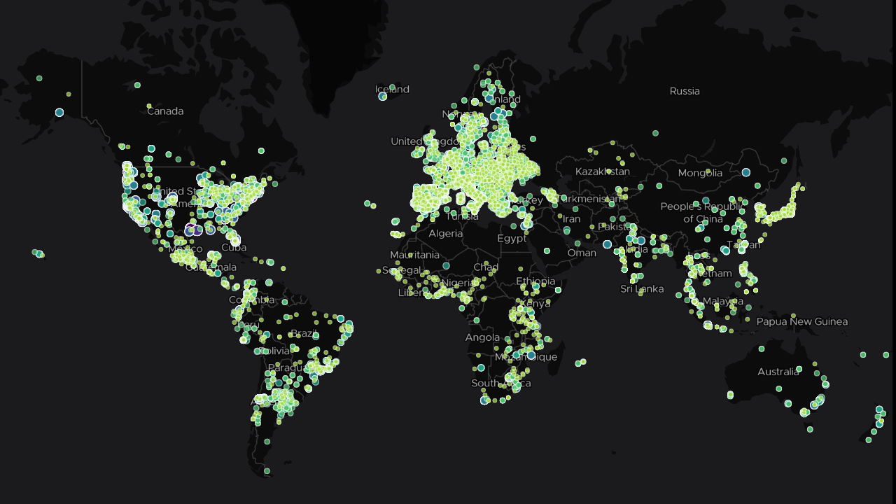
What’s encouraging is that we’re already seeing some of this cross-pollination and diffusion of policy and learning across cities around the world. This map of subnational climate change actions from the Data-Driven Lab includes more than 10,000 cities around the world that are taking SDG 13 on Climate Action in their own hands, participating in climate action networks, such as C40 Cities for Climate Leadership or the Global Covenant of Mayors for Climate & Energy. These cities are pledging their own emission reduction targets, reporting their emission inventories, setting mid and long-term targets as far into the future as 2050 to decarbonize their economies.
5. These climate actions from cities are having a measurable impact – on top of what national governments have pledged.
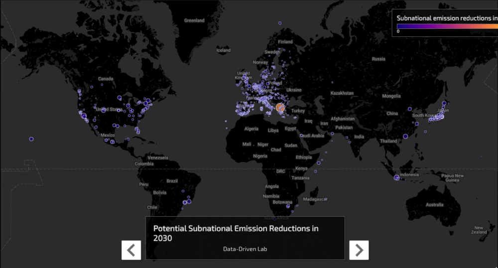
Just 6,000 of these cities, combined with actions from 1,500 companies, in the top-10 emitting countries 1.2 to 2.0 Gigatons CO2-equivalent in 2030 – that’s 4% of global total annual emissions – on top of what national governments have pledged. Our latest report in collaboration with the NewClimate Institute, PBL Netherlands Assessment Agency, German Development Institute, Oxford University, and M2020, delves into more detail how these actors are taking their own economy-wide emission targets and working in collaboration with each other and national governments to help the world get closer to its goals of containing global temperature rise within 1.5 or 2 degrees C. To build cities that can help the world move closer towards the 2030 Sustainable Development Agenda, more leadership efforts like these — and evidence of implementation — are needed.
Many thanks to Data-Driven Lab Research Assistant Nick Chin, Yale-NUS ’21, for his help in developing these visualizations.
Recent Comments