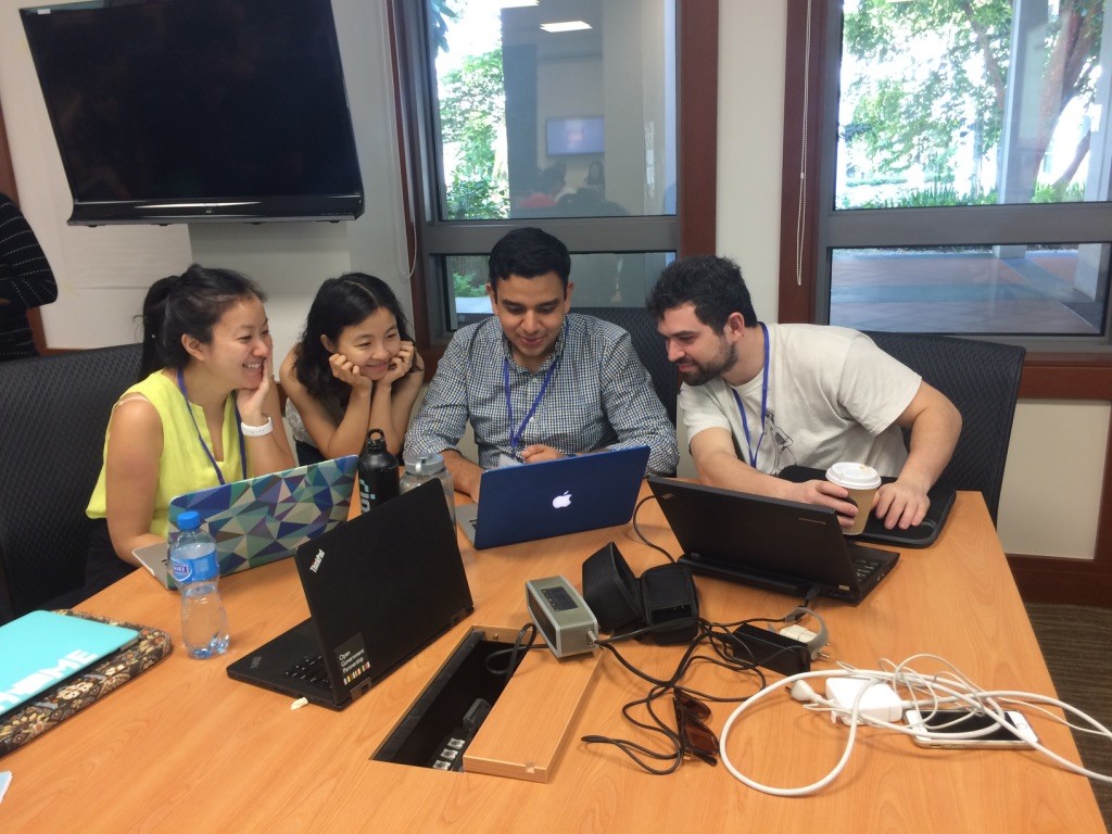
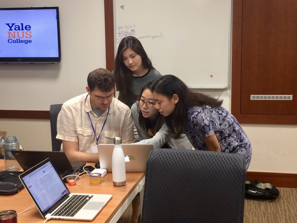
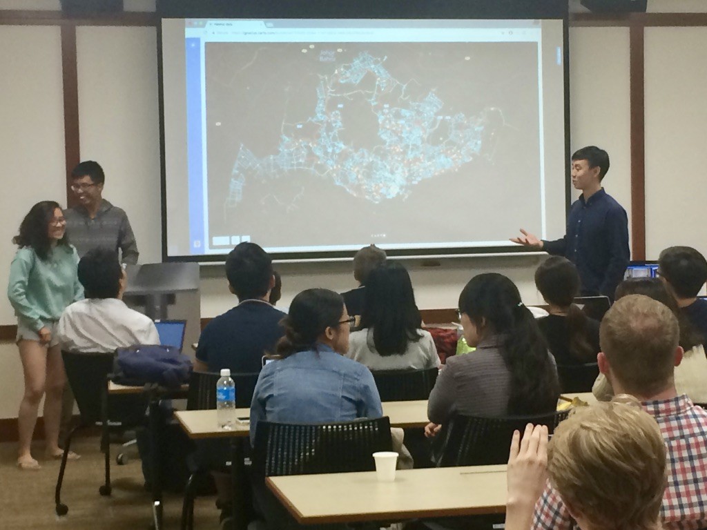
Data-Driven team members Dr. Angel Hsu, Udit Jain, and Matt Moroney consult on a data analysis question.
“R is like piano – you have to practice the scales before you jump into playing Jimi Hendrix.” These words of advice, from Data-Driven Research Assistant and Yale School of Forestry and Environmental Studies masters student Matt Moroney, felt particularly right for the first inaugural Yale-NUS Data 1.0 hackathon. Hackathons typically bring coders, programmers, and data visualization whizzes together to tackle stubborn challenges, or wrestle unruly data into more usable formats. Data 1.0, held on March 18 at the Yale-NUS campus in Singapore, tailored this format to beginners.
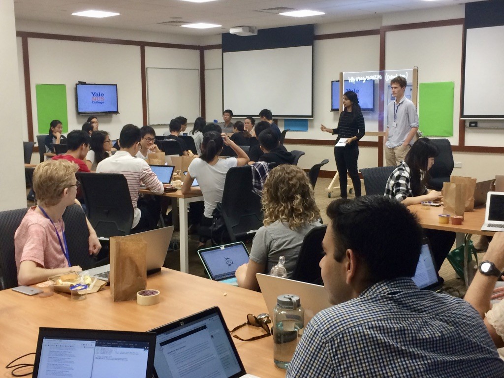
Co-organizers Swarnima Sicar and Ross Rauber, Yale-NUS ’19, begin Data Hack 1.0.
The event, led by Yale-NUS students with support from Data-Driven Yale, included introductory workshops to help participants take a day-long dive into a dataset. In the days before the Hackathon, Data-Driven Student Researchers and Research Associates taught workshops on how to use R, a free software environment for statistical computing and graphics; to collect information from websites and to visualize data; to design and create Tableau and CartoDB visualizations; and to use traditional and new media to share their findings.
Ryan Thomas leads a workshop on using R to collect information from websites.
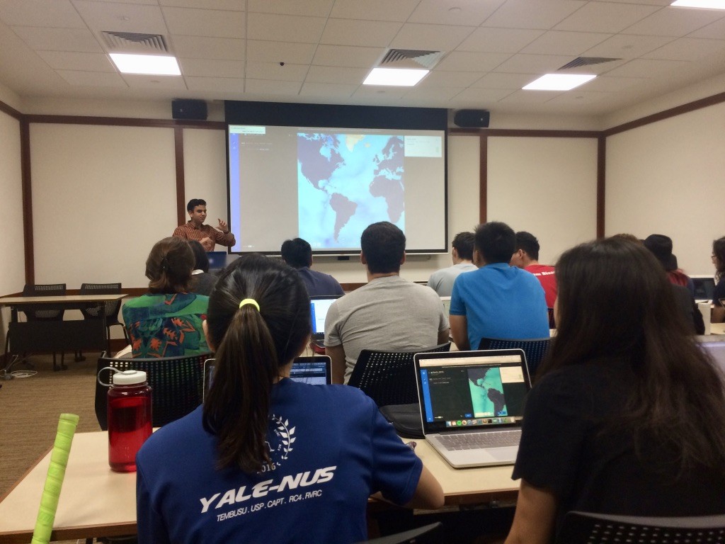
Udit Jain leads a workshop on visualizing data using Carto DB.
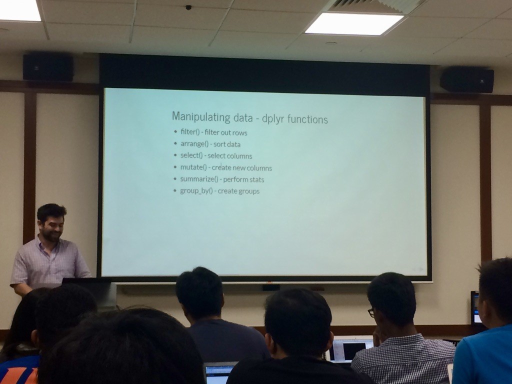
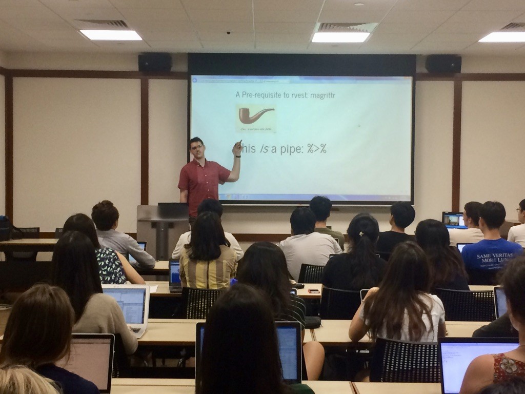
Matt Moroney teaches a workshop on using modern packages in R.
During the event, teams practiced their skills in computer programming, statistical analysis and data visualization, as Data-Driven staff and guests from Google milled about, offering advice and helping troubleshoot questions. Participants investigated topics ranging from the hidden implications of college major choices, to the kinds of damage caused by different forms of natural disasters.
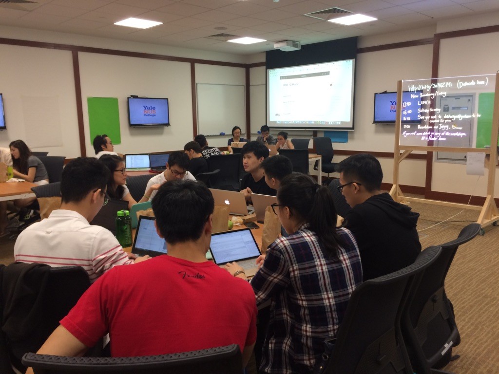
The hackathon begins, as teams discuss which data set they’ll explore.
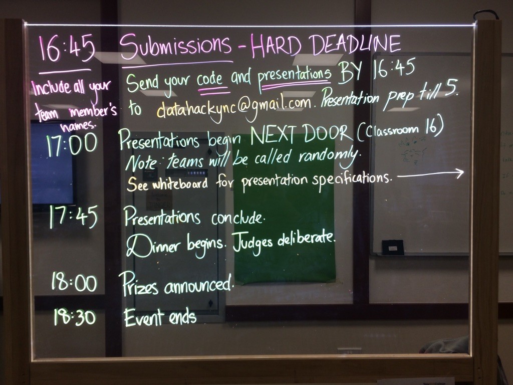
A light board tracks the Data 1.0 schedule.
Ryan Thomas troubleshoots a question with Charis, Wyin and Jasmine of the Jia Peng Liao team.
One team used a mix of heat maps, infographics, and Samuel L. Jackson pictures to convey their network analysis of movie actors, taking home the prize for the best visual representation. Another found the quickest route for visiting all of Singapore’s 137 hawker centers, earning them the title of both the project with the most ambitious implementation and the most over the top solution to a non-existent problem.
Iggy, Keith, Max, and HiuFung tackle the “hawker traveling salesman problem,” identifying the quickest path through the city’s 137 hawker centers.
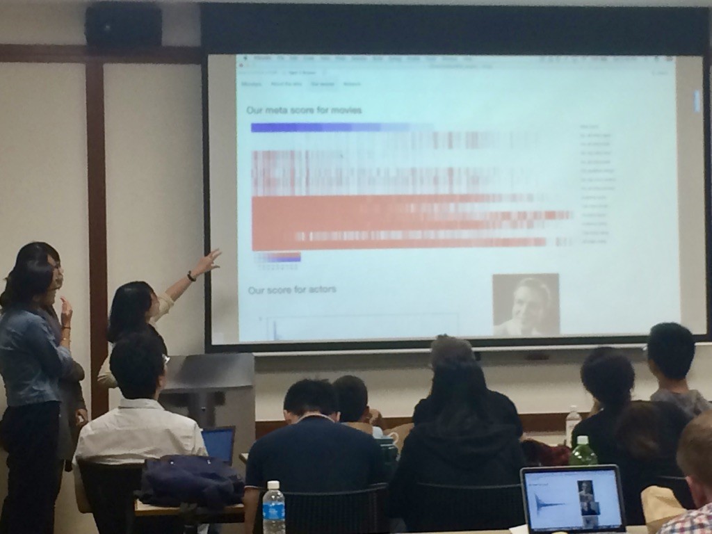
Ginny, ChenYing, and NingYilin share the results of the actor network they built from an IMDB data set.
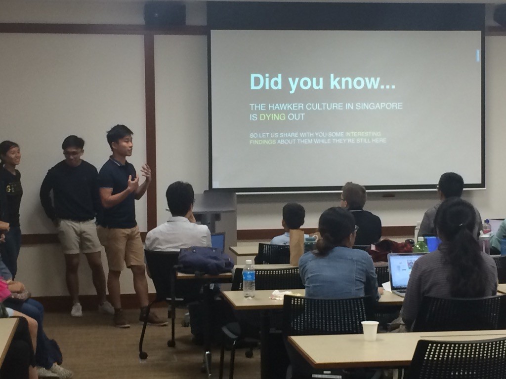
The hawker data set emerged as one of the most popular starting points for teams. Here, Brenda, Lim Wen, Nicholas, and Yong Zhun look into the ways hawker centers overlap with factors ranging from public transit stations to age to urban compactness.
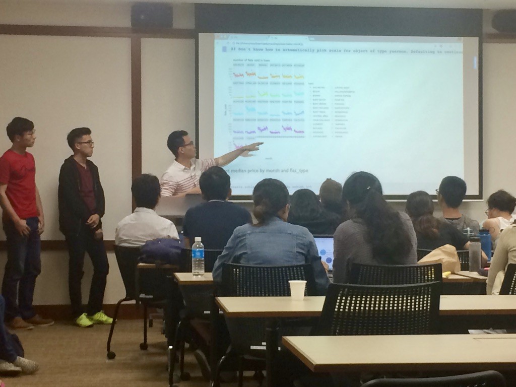
Cal, Jin Cong, Naomi, Nelson draw on R to determine what factors influence resale value in Singapore’s housing market.
The Jia Peng Lao team, which takes its name from the Singlish phrase Time to eat!, discussed the ways hawker center density and cuisine varies across neighborhoods with different income levels and demographics, earning the award for the best presentation. A detailed probe into the factors affecting the resale value of homes in Singapore earned the prize for the most thorough analysis. Many teams drew on the earlier workshops, using CartoDB, Tableau, and R to probe the datasets and share their findings.
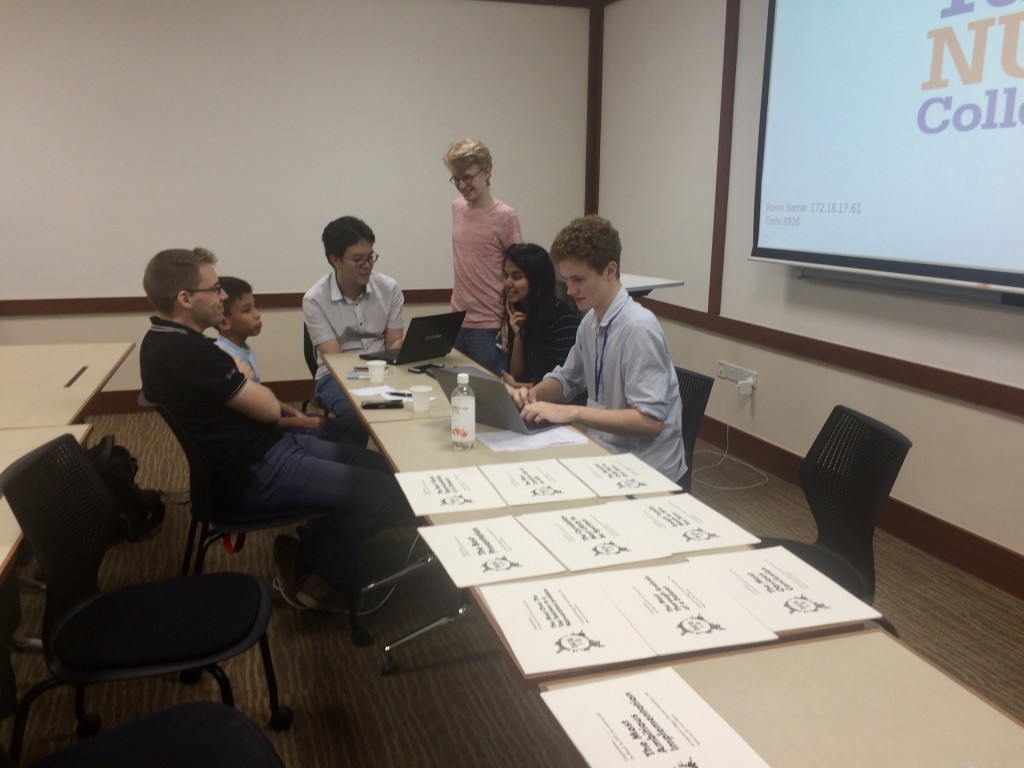
Events were awarded by judges including the events’ student organizers; Datascience.sg co-founder Koo Ping Shung; Dr. Alex Cook, Associate Professor at the Saw Swee Hock School of Public Health; and his 9-year-old son, Uri, whose input helped ensure that winning entries were easy for audiences of all ages and backgrounds to understand.
The judges deliberate.
However, the real value of the Hackathon lay in helping to build a local community around data analysis and computer programming. “Many people are intimidated by these topics, or don’t know where to start,” said Swarnima Sicar, a Yale-NUS sophomore and co-organizer of the event. Ross Rauber, also a Yale-NUS sophomore and co-organizer, added: “We wanted to create a space where people can come together to meet others and build a community to explore these topics further.”
Watch the workshops:
Recent Comments